What is Responsive Website Design and Why Does it Matter?
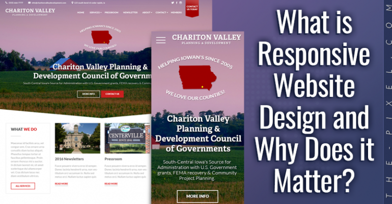
What is Responsive Website Design and Why Does it Matter?
Responsive web design that delivers a seamless experience on every screen
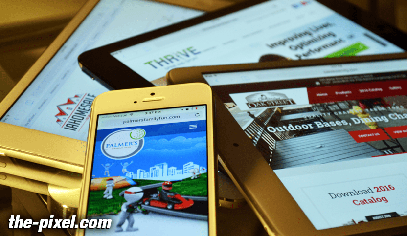
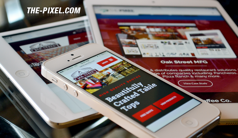
A responsive website is one that looks, feels, and functions consistently across every screen. Whether someone is visiting from a phone, tablet, or desktop, the experience should feel natural, easy to navigate, and built for that device.
Your audience isn’t using just one type of screen. They’re moving between devices throughout the day. If your website doesn’t adapt to those shifts, it creates friction—and friction costs you attention, trust, and conversions.
A responsive website removes that friction.
A consistent experience across every device
At its core, responsive design is about continuity.
When users move from one device to another, they shouldn’t feel like they’re learning a new interface. The structure, content, and flow should feel familiar no matter how they access your site.
If your website feels broken, cluttered, or hard to use on certain screens, users won’t stick around. Just like poor customer service leaves a bad impression, a frustrating website experience can damage how people perceive your brand.
Your website should guide users—not slow them down.
How layouts adapt to different screens
One of the key elements of responsive design is how content adjusts as screen sizes change.
On larger screens, content can sit side by side in columns. On smaller screens, those same elements stack vertically. The goal is to preserve hierarchy and readability while making the layout feel natural for the device.
Good responsive design keeps everything in logical order:
- Left to right
- Top to bottom
- Clear visual hierarchy
Users should never feel lost or unsure where to go next.
Knowing what to simplify
Responsive design isn’t just about resizing content. It’s about making smart decisions.
What works on a large screen doesn’t always translate well to smaller ones. Heavy visuals, complex animations, or unnecessary elements can slow things down and distract from what actually matters.
On smaller screens especially, clarity and speed take priority.
This means:
- Removing unnecessary elements
- Simplifying navigation
- Prioritizing key actions
- Delivering content quickly
A clean, focused experience will always outperform one that tries to do too much.
Designing with a mobile-first mindset
The most effective way to approach responsive design is to start with the smallest screen first.
Designing for mobile forces you to think critically about:
- What content is essential
- What actions users need to take
- How to communicate clearly with less space
When you solve for the most constrained experience first, everything else becomes easier to scale.
It also leads to better decisions. You’re not adding complexity—you’re building with intention.
Why responsive design matters for your business
A responsive website does more than improve usability. It directly impacts how your business performs online.
Better user experience (UI)
When your site is easy to use, people stay longer, explore more, and take action. Whether that action is filling out a form, making a call, or requesting a quote, the path should feel effortless.
Stronger search visibility
Search engines prioritize websites that are accessible and easy to navigate across devices. A responsive structure makes it easier for your content to be discovered, indexed, and ranked.
More engagement from social traffic
A large portion of website traffic comes from social platforms. Most users access that content on mobile devices. If your site doesn’t perform well there, you lose momentum immediately.
Higher conversion potential
A smooth, consistent experience builds trust. When users don’t have to fight the interface, they’re far more likely to take the next step.
Responsive design is the standard—not an upgrade
Responsive design is no longer optional. It’s the baseline for any modern website.
At ThePixel, every website is designed with this approach from the start. We prioritize structure, clarity, and performance early in the process so the final product works seamlessly across all devices.
Starting with the most constrained experience helps remove unnecessary complexity and keeps the focus on what matters most—helping users find what they need and take action.
Final thought
Your website should work everywhere your audience is.
Not just visually, but functionally.
A responsive website doesn’t just adjust to screen sizes—it supports your users, reinforces your brand, and creates a consistent experience that builds trust over time.
If your website isn’t doing that, it’s holding your business back.
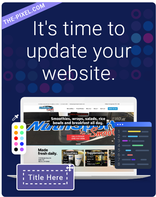
Hire ThePixel to build your next website!
Since our founding in 2008, we’ve created and launched many types of business websites. Over the last decade and we’ve learned a thing or two! That’s why we’re masters of our craft, let us help you build the website of your dreams – one that generates traffic, leads and conversions.
Are you ready to start? If yes, contact ThePixel and one of our representatives will guide you through the website phases and how the process works either by a Zoom Meeting or phone.
