How Clear Calls to Action Improve Website User Experience
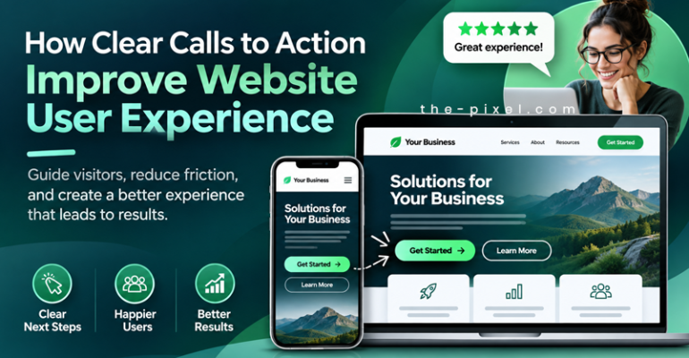
How Clear Calls to Action Improve Website User Experience
How Clear Calls to Action Improve Website User Experience
Clear terminology and intuitive calls to action are often overlooked parts of website user experience. Consistent wording helps visitors navigate your website, find key information, and understand what to do next. Unclear labels or competing instructions can create confusion, causing visitors to leave before taking action.
Terminology and calls to action serve different purposes, but they work together. Navigation labels help visitors find what they need, while calls to action guide their next step. Using consistent language throughout that journey helps people understand their options and move forward with confidence.
An effective call to action, or CTA, connects the information visitors need with an action they are ready to take.
Make the Next Step Clear
A call to action should explain what visitors can do next. Wording such as “Learn More” or “Get Started” can work in the right context, but it may leave people wondering what they will find after clicking.
The content, button label, and destination should work together. If a section introduces your website design services, “Explore Website Design Services” gives visitors a clearer expectation than a general “Learn More” link.
Here are a few examples:
| General wording | More specific wording |
|---|---|
| Learn More | Explore Website Design Services |
| Submit | Request Your Website Evaluation |
| Get Started | Tell Us About Your Project |
| Download | Download the Website Planning Guide |
More words do not automatically make a better CTA. The goal is to explain the action clearly and concisely. Sometimes “View Packages” is all visitors need.
Use Consistent Terminology Throughout Your Website
Clear calls to action begin with the language used throughout your website. If your navigation says “Packages,” your service page says “Plans,” and your button says “View Options,” visitors may have to stop and determine whether these refer to the same thing.
That extra effort can interrupt an otherwise straightforward experience.
Across website, enterprise portal, and mobile application design, consistent terminology helps people recognize where they are, understand their options, and find their next step. This becomes especially valuable when visitors move between several pages before making a decision.
Choose wording that makes sense to your audience, then use it consistently across navigation, headings, links, buttons, and forms. Internal business terminology may be familiar to your team but unfamiliar to your customers.
Match Your Call to Action to the Visitor’s Readiness
Not everyone who visits your website is ready to contact you. Some people are learning about your services. Others are comparing providers, reviewing your work, or trying to understand the cost.
Your calls to action should support those different needs.
Someone visiting a website design page for the first time may want to “View Our Work.” After reviewing a case study, they may be ready to “Explore Website Packages” or “Discuss Your Project.”
Each section should answer a useful question and provide a relevant next step. Asking visitors to request a quote before they understand your services may be premature.
Keep the primary action easy to identify. When several equally prominent buttons compete for attention, visitors have to spend more effort deciding where to go. Supporting links can provide alternatives without giving every action the same visual emphasis.
Deliver What Your Button Promises
The experience after the click matters just as much as the wording before it.
If a button says “Schedule Your Appointment,” visitors will likely expect to choose a date and time. If the destination is a form that asks them to submit their information and wait for a return call, “Request an Appointment” may set a more accurate expectation.
The same applies to downloads, evaluations, and pricing information. A “View Pricing” button should lead to useful pricing information. If downloading a guide requires an email address, explain that requirement near the CTA.
When the destination matches the promise, visitors can move forward with a clearer understanding of what happens next.
Answer Questions Before Asking Visitors to Act
A well-written button cannot answer every question a visitor has.
Before contacting a business, people may want to know what is included, how the process works, what it costs, or what happens after they submit a form. Those questions should influence CTA placement and the surrounding content.
For a chiropractic website, that might mean explaining the first appointment before inviting someone to schedule. For a website design service, it might mean outlining the project process and payment schedule before asking someone to discuss their project.
Supporting information can also be brief. A sentence beneath a form explaining who will respond and what happens next can make the process easier to understand.
Look for unanswered questions that could prevent someone from moving forward. Place helpful information where visitors need it, close to the relevant action.
Using Google Analytics Events to Measure CTA Engagement
A practical example comes from our chiropractic website case study, where we updated the call to action from “Book an Appointment” to “Schedule Your Appointment.” Using Google Analytics event tracking, we measured visitor interactions and identified increased engagement with the revised CTA.
Although both phrases communicate a similar action, the results demonstrate how thoughtful wording can influence user behavior. Google Analytics provides valuable insight into which calls to action attract attention, how visitors interact with them, and whether those interactions contribute to meaningful conversions.
However, increased CTA engagement does not necessarily mean more appointments are being scheduled. Tracking both button clicks and completed appointment requests helps distinguish initial interest from successful conversions.
For example, when Google Analytics shows an increase in CTA clicks but appointment submissions remain low, the next step is to evaluate the scheduling experience. Confusing form fields, unnecessary steps, unexpected requirements, or technical issues may prevent visitors from completing their requests. Identifying these friction points helps businesses make informed UX improvements based on measurable user behavior rather than assumptions.
To assess a CTA change, review:
- The tracked action: Does the event measure a button click, form submission, or completed booking?
- The comparison period: Are the periods comparable in length and business conditions?
- Traffic volume and sources: Did the number or type of visitors change?
- Other website updates: Were the layout, content, form, or scheduling tools also changed?
Compare the percentage of visitors taking action alongside the total number of events. More clicks during a higher-traffic period do not necessarily mean the CTA performed better.
If several elements changed together, describe the results as part of the broader website improvement. Event tracking helps identify patterns, while a controlled comparison provides stronger evidence about the effect of a specific wording change.
Review Your Website’s Calls to Action
Start with the pages that support your most important business goals. Read each page as someone unfamiliar with your business, then follow its links and buttons through to their destinations.
Ask yourself:
- Does the wording clearly describe the next step?
- Are terms used consistently throughout the website?
- Is the primary action easy to identify?
- Does the surrounding content answer relevant questions?
- Does the destination deliver what the button promises?
- Do buttons and forms work on mobile devices and with keyboard navigation?
- Are you measuring both clicks and completed actions?
A small wording change may clarify a confusing step. In other cases, the content, page structure, or form may need attention. Reviewing the full journey helps reveal where the experience breaks down.
Make Every Next Step Easier to Understand
Clear calls to action are part of a connected website experience. Terminology helps visitors find information, content helps them evaluate their options, and CTAs help them move forward.
At ThePixel, we review these elements together to identify unnecessary friction and opportunities to improve the user journey. The goal is to make each step understandable, useful, and connected to what visitors need.
Need help identifying where visitors get stuck? Tell us about your website and the actions you want it to support.