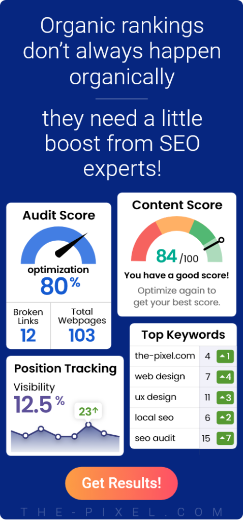
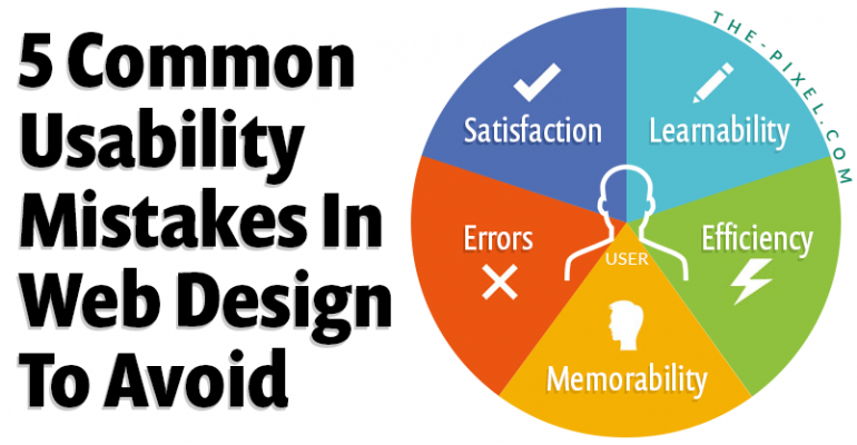
5 Common Usability Mistakes in Web Design to Avoid
5 Common Usability Mistakes in Web Design to Avoid
Where user experience breaks down and how to fix it
Most usability issues are not visual. They come from structure, flow, and how users move through an experience. When those break down, users hesitate, get confused, and leave.
1. Confusing or unclear navigation
Navigation is more than a menu. It is how users understand where they are and what to do next. When navigation is hidden, overly complex, or not aligned with user intent, it creates friction and slows users down. Clear navigation helps users move forward with confidence, especially when supported by a strong UX + Analytics Optimization strategy.
• Menus organized around internal structure instead of user tasks
• Hidden or hard to find navigation on complex websites
• Too many options that create decision fatigue
• No clear next step or pathway after landing on a page
2. Poor content hierarchy and readability
If users cannot quickly scan and understand content, they will not engage with it. Large text blocks and weak hierarchy make it harder to find important information. Users look for signals that guide them through content. Without that structure, they lose interest.
• Large blocks of text with no clear sections or breaks
• Weak heading structure that does not guide the user
• Inconsistent spacing that disrupts visual flow
• Important information buried instead of highlighted
3. Missing or ineffective search
Users expect to find what they need instantly. Without a visible and functional search experience, they are forced to browse. This increases frustration and slows down task completion. Search should support navigation, not replace it.
• No search functionality on content heavy websites
• Search bar placed in hard to find locations
• Irrelevant or inaccurate search results
• No autocomplete or filtering to improve speed
4. Broken user flows and friction points
Most usability problems come from unclear next steps or disconnected experiences. Users may engage with content but still not complete a task. Friction builds when actions are not obvious or when too many choices compete. This leads to drop off and missed conversions.
• Multiple competing calls to action on the same page
• No clear progression from one step to the next
• Forms or processes that feel too long or confusing
• Mismatch between user intent and page content
5. Weak mobile experience
Responsive design alone is not enough. Mobile users need fast, simple, and focused interactions. If content is too heavy or actions are unclear, users will leave quickly. Designing for mobile improves usability across all devices.
• Navigation that is difficult to use on smaller screens
• Buttons or actions placed outside natural thumb reach
• Slow load times that increase drop off
• Content that is too dense or not optimized for mobile
How to tell if your website has usability issues
Most usability problems are not obvious by looking at a page. They show up in how users behave.
If users are slowing down, hesitating, or leaving without taking action, there is usually friction in the experience.
• High traffic but low conversions
• Users visit multiple pages but do not take action
• Drop off in key funnels, forms, or checkout flows
• Repeated clicks, hesitation, or backtracking in session recordings
These are signals that something in the structure, navigation, or flow is breaking down.
What good usability looks like
Good UX is not something users notice. It is something they move through without thinking.
When usability is strong, the experience feels clear, predictable, and easy to navigate.
• Users understand what to do right away
• Navigation feels simple and consistent
• Key actions are easy to find and complete
• The experience keeps users moving forward without hesitation
When users do not have to stop and think, the experience is working.
How to approach usability
Usability is not solved by design alone. It starts with understanding how users move through an experience.
ThePixel focuses on structure first, then refines the interface to support it.
• Review navigation, content structure, and hierarchy
• Analyze user behavior, funnels, and drop off points
• Identify friction in key journeys and workflows
• Simplify and optimize based on real data and user behavior
This approach helps create experiences that are not only clean, but effective.
Example user journey breakdown
A typical user journey is not complicated, but small points of confusion can interrupt it.
Landing Page → Scan Content → Evaluate → Take Action → Convert
↓
Confusion Point
↓
Drop Off
Most usability issues happen in that moment of hesitation.
The goal is to remove that friction so users can move forward without stopping.
Quick usability check
A quick way to evaluate your website is to look at how easily users can move through it.
• Can users find what they need within a few clicks
• Is the next step clear on every page
• Does your navigation match what users are trying to do
• Are users completing key actions without confusion
If the answer is no to any of these, there is an opportunity to improve usability.
Understand what users are actually experiencing
Most websites look fine on the surface, but the real issues show up in how users move through the experience.
When users hesitate, revisit pages, or leave without taking action, it usually points to gaps in structure, flow, or clarity. These are not visual problems. They are experience problems.
ThePixel helps break down user behavior, identify where friction exists, and translate that into focused improvements that make the experience easier to navigate and more effective.
If you want a clearer understanding of what users are experiencing on your site, we can help you find it.
Improve how your website performs without redesigning everything
Not every problem requires a full redesign. In many cases, small structural changes can create meaningful improvements.
When navigation is clearer, content is better organized, and next steps are more obvious, users move faster and complete more actions. That is where performance starts to improve.
ThePixel focuses on optimizing what already exists by refining structure, simplifying flows, and aligning the experience with user intent.
If your website is not performing the way it should, it may not need to be rebuilt. It may just need to be improved in the right places.