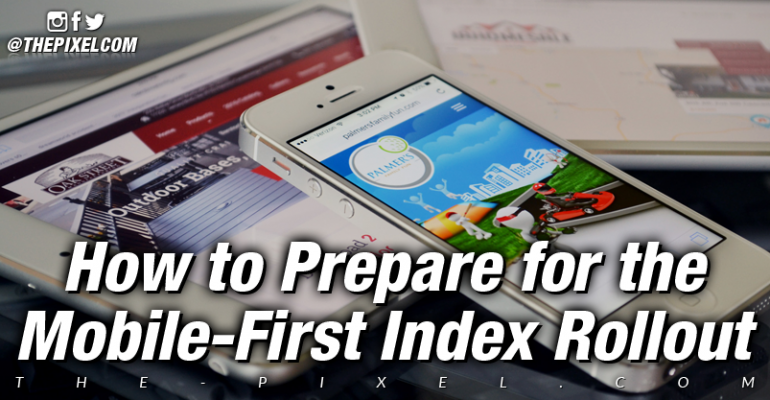
How to Prepare for the Mobile-First Index Rollout
How to Prepare for the Mobile-First Index Rollout
Make sure you have a responsive website.
If you don’t already have a responsive website, you need to make sure you have one ready to go. You can do this with a website template solution. If you’re not sure how to go about a responsive design, talk to your webmaster, or reach out to us for help with your web design.
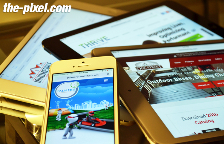
Do you think you have a responsive website, but you’re not sure? You can use this tool to quickly see how your website looks on tablets, smartphones, desktops, and laptops. It will tell you if you are responsive. Your site should look the same across all devices, with adjustments automatically made for screen size.
If your mobile site doesn’t match your desktop site or if you need to get mobile web optimization, you may see a negative effect on your SEO. This is because if your mobile site has less content than your desktop version, you may not rank as high since Google will prioritize the mobile-friendly site.
Even though a responsive website will take more time than creating a mobile-friendly site with the m-dot approach, it maintains unity for the desktop/mobile experience, for all pages.
Because search engines want to make their users happy by providing relevant and popular content, content is often the primary focus on a website. However, you can’t forget to focus on the number of users who are looking at your site as well.
One way to answer your visitors keep coming back for more is to make sure your mobile website has been developed with user experience as one of your top priorities. Rely on CSS and other kinds of front end coding to style your mobile site to make it easier to read and navigate.
Once you have made the effort to update your website to a responsive version, it’s important to make sure that Google is able to see these changes. You can use the Fetch and Render tool available in the Google Search Console to see how Google sees your website. All you have to do is specify that the user agent is a smartphone, and you’ll be able to see how Google will deliver your website to a user coming to your website from a smartphone.
Make sure any necessary 301 redirects are setup appropriately.
If you don’t have a responsive website and you’ve been relying on an m-dot on your domain to handle the mobile side of things – once you get your responsive website ready, you’ll want to set up 301 redirects from the m-dot domain to the full version of the domain. This way, people who are used to going to the m-dot will automatically be taken to the correct page on your website, which will adjust for the mobile device.
Make sure you do the 301 redirects on an individual basis, pointing each mobile URL to the equivalent responsive URL.
What if I want to switch from dynamic serving to responsive design?
If you are using dynamic serving and want to move to responsive design, you can do it. You do not need to add or change any redirects to complete the process, however.
Better to make changes now than to wait.
If the idea of making sure your website is ready for the mobile first index roll out is overwhelming, don’t be afraid to reach out to ask for help. We know what needs to be done to make sure your website is mobile friendly and ready for the change is in the Google search result pages.
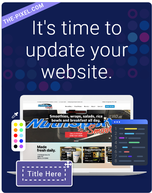
Hire ThePixel to build your next website!
Since our founding in 2008, we’ve created and launched many types of business websites. Over the last decade and we’ve learned a thing or two! That’s why we’re masters of our craft, let us help you build the website of your dreams – one that generates traffic, leads and conversions.
Are you ready to start? If yes, contact ThePixel and one of our representatives will guide you through the website phases and how the process works either by a Zoom Meeting or phone.
