6 Website Design Mistakes Impacting Your Leads

6 Website Design Mistakes Impacting Your Leads
Every website is different, and each site receives different types and volumes of visitors.
You may from time to time come upon a website that you find visually attractive because it follows certain web design trends or because it uses some novel visual effects. You might imagine your own site benefiting from a similar look or design feature. However, you should consider that the site may have been designed with objectives that are entirely different from, and maybe even incompatible with, your own goals.
There will always be trends in web design, and most of them come and go very quickly, and many interfere with search engine optimization (remember when website home pages used Flash as a splash page? SEO death). You should focus on ensuring that you have an effective website design for the purposes your website serves in your business. For many business websites to be effective, their design (1) must not interfere with the SEO, and (2) convert visitors into clients.
Every website is different, and each site receives different types and volumes of visitors. Therefore, before considering a major redesign or thinking about implementing an innovative visual effect on your site, you should carefully evaluate whether that change would have a positive impact on your site’s conversions.
It’s easy to think that your website should be on the cutting edge of web design trends, but we encourage you to consider the ultimate goal of your companies website: converting visitors into customers. In this post we provide six common website design errors that people fall into that might actually hurt, rather than help, their website serve their purpose.
1. Bad mobile experience
For many businesses, the mobile website experience is the key to getting new customers from the internet. With well over half of web traffic now on mobile, responsive website design is not just trendy but necessary. Websites that have responsive designs adapt dynamically to the user’s device and screen size. However, making your website responsive is not enough to ensure an excellent mobile experience.
Avoid thinking of your mobile website as just a simplified version of the desktop version.
Many designers continue designing websites focusing primarily on the desktop experience, even when the variety of screen sizes and mobile devices continues to grow on a daily basis. Unless the designer treats the mobile user as separate and distinct with their own set of behaviors and expectations, even a responsive website design will not necessarily yield a pleasing mobile experience.
We recommend adopting a different approach when designing your website: think mobile first. This is especially true for law firms looking to reach consumers, such as personal injury, criminal, and family law. Mobile-first design is a technique where the design begins with consideration of how it will look on small screens and then expands to the design of larger-screen versions (as compared to the reverse, which was the traditional approach). Remember that mobile traffic is the majority, and it’s only increasing. Designing for your mobile visitors should be your priority, not an afterthought.
2. Poor readability
Good typography is essential for a high-quality design. You cannot lose sight of how much of your website is actually text. Sometimes people think that changing their website’s typography—the font or font family, the text size, or even the color—will give it a more modern look. While that might be the case in some instances, changing typography can only improve your website if you do it deliberately and in a particular way. Here are two examples of how typographical changes can have on your site:
- Using Low-Contrast Color Combinations. Some designs that purport to be “clean” or “minimalist” use low-contrast color combinations (such as light gray text over a white background). Low-contrast text hurts usability because it makes text more difficult to read. On mobile devices, where the screens are much smaller, that difficulty may be even greater. You could be alienating potential clients just because you are making it difficult for them to read the information on your website. You don’t have to use white-on-black or black-on-white, but as a general rule, the best combination is to use dark text over a light background because it is easiest to read.
- Switching to a Custom Web Font. Custom fonts certainly have their appeal and can be more interesting than standard fonts you see everywhere. One downside of using a custom font is that it entails a performance cost, as the font itself has to be downloaded to the browser. This directly influences load time and user experience because the text will not be rendered with the new font until the typeface set has been fully downloaded. Accordingly, we recommend either using only web-safe fonts (i.e., system-installed fonts such as Arial or Times New Roman) or using Google fonts that are used on many other websites, and thus likely to be cached in the users’ browsers already (e.g., Open Sans, Roboto).
3. Poor site navigation in the navigation bar
A website’s navigation involves many aspects, including the organization of your content. A website’s main navigation is usually located in the header in the form of a navigation bar. The navigation bar is one of your site’s most important design elements, not only because it guides the user beyond the main page, but it is also a tool that provides the user a sense of direction to easily navigate throughout your website.
It is somewhat surprising that one of the current trends to achieve a minimalist or modern look is to hide or make less evident this navigational element in a website, with the argument being that it could distract the user from other visual elements in the header. However, the most common behavior of users when landing on a new website is to scan the options, and if at a glance they do not find what they are looking for, they will most probably leave the site.
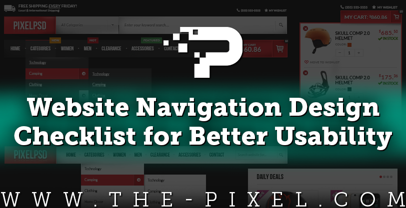
We suggest following known design patterns in order to guarantee that the user can access the content within your site quickly and easily. Among those design patterns is to have a simple navigation bar in your site’s header with the most important categories of content you want users to see. Normally this leads to 6-8 items in the menu bar, which almost always include Home, Services, Solutions, Products, Industry, News, About and Contact Us. We must remember that only the principal options are the ones that should be visible in the navigation bar. Saturating the visitor with too many options can be counterproductive. The rule of thumb is to keep the navigation simple and easy to use.
4. Making important information hard to find on your webpage
Something similar to the incorrect use of typography occurs with other important visual elements on websites. People often believe that highlighting certain elements such as the calls-to-action could make your website’s design look too busy. However, by not doing so you are missing valuable opportunities to encourage visitors to take the very actions the website is intended to facilitate. It is essential that the key elements on your website visually stand out, and make sure that there are not too many elements competing for the visitor’s attention at the same time. You want visitors to focus on the actions you want them to take, which in most cases is to contact the company.
A good designer is capable of highlighting key visual elements subtly and harmoniously with the rest of the elements on the web page. One of the most popular directions of modern design is called flat design. Introduced by Microsoft and embraced later by Apple and Google, flat design uses simple two-dimensional elements and reduces shadow and texture usage. One of the disadvantages of flat design is that certain user interface elements are no longer evident (e.g., a button could be confused with a simple text box). Thus, some say that flat design went too far regarding minimalist design causing serious usability problems. A straightforward piece of advice is to make each element obvious (e.g., buttons should look “clickable”) and the text should always be legible regardless of whether it is on an image or a solid background. You should also strategically place your calls to action in such a way that they can always be seen when the visitor is ready to make a decision or take action.
Lastly, it is necessary that contact information, such as your address and phone numbers, be clear and easily distinguishable. Remember to include useful information such as your office hours. If your webpage has a sidebar, that is a good place to include support information that allows users to learn more about the services you provide or the benefits you offer. In other words, the essential information about your business that visitors look for when they land on your site’s main page (homepage) should be clearly identifiable, or there should be links in place to allow visitors to navigate to internal pages that contain further details.
5. Using pop-ups
It is the moment to reevaluate the use of pop-ups on your website. The unjustified and indiscriminate use of pop-ups can ruin visitors’ perceptions about your website and harm the user experience. User experience is important for a website to meet its objectives, especially on mobile devices where the interaction area is smaller. The misuse of pop-ups is one of the main reasons that a user leaves a site, or even worse, blocks it.
Of course, not every pop-up is bad; their poor reputation is mainly due to poor design or implementation. We suggest using pop-ups only as a means of confirming an action, obtaining feedback, or sharing useful content. Also, think carefully about the pop-up’s timing and its position on the web page. If you are considering implementing it on mobile, make sure that it does not obstruct your site’s main content, navigation or other calls to action (such as click to call buttons), and that it is easy for users to close. Before deciding to use pop-ups on your website, ask yourself whether the benefits outweigh the potential costs.
6. Large media files and images
A new trend is to see large images, animations, or videos reproduced in the background the moment we enter a site. While some people might think that flashy graphics capture visitors’ attention, in reality they become a distraction from what is most important to conversions: your content. Large images and files can not only cause your site to look cluttered, but they can also directly impact its page speed (load time). Not only do visitors tend to react negatively to longer page load times, but Google has indicated that page speed is also a ranking factor. The tenuous benefits of these types of features are not worth the certain costs of adding them.
We recommend using images or videos only when necessary and relevant to your users’ experience. Images should be primarily thought of as a support for the text. There are also other forms of animation that are not a burden on your page speed and are less intrusive (e.g., micro interactions). A micro interaction improves the way in which information is presented and adds subtle dynamic elements to normally static experiences. For example, these small animations, implemented just through using code, may improve a visitor’s experience without slowing down the page load speed. The key is to capture the visitor’s attention at just the right moment without negatively affecting your site’s performance or your visitor’s perception of it.
Conclusion
There are many factors that contribute to an effective design that attracts visitors’ attention and converts those visitors into quality leads and clients. It is important to take a holistic approach to website design that neither ignores nor overstates any one factor. Your visitors consume visual content daily, which is why you must ensure that your website’s design is pleasant and offers an optimized user experience.
Remember the old adage: “just because we can do something does not mean that we should do it.” This does not mean ignoring new design trends. We suggest instead that you weigh whether a particular feature furthers your website’s purpose, and, if you decide that the feature should be adopted, you should also find the most efficient way to do so. Finally, remember to avoid designing for yourself; rather, you should always keep in mind that you are designing for your audience.
Hire ThePixel to build your next website!
Since our founding in 2008, we’ve created and launched many types of business websites. Over the last decade and we’ve learned a thing or two! That’s why we’re masters of our craft, let us help you build the website of your dreams – one that generates traffic, leads and conversions.
Are you ready to start? If yes, contact ThePixel and one of our representatives will guide you through the website phases and how the process works either by a Zoom Meeting or phone.
