5 Ways To Optimize Your Website User Experience (UX)
5 Ways To Optimize Your Website User Experience (UX)
Helping you convert more leads and delighting your users all at once
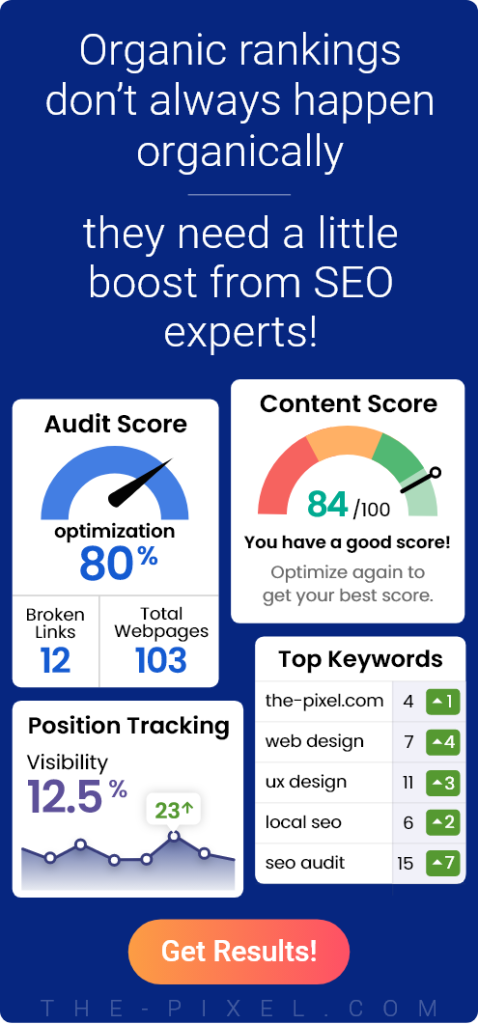
Creating the ultimate user experience doesn’t happen overnight, and there’s no one area you can improve to create the ultimate website. It’s the culmination of many small things. The list below is by no means exhaustive, but it’s a great way to make sure your website is as engaging as possible. You could do all of the below in a single day (or maybe two), but the effects will be much longer lasting, helping you convert more leads and delighting your users all at once.
1. Your page load speed
First things first, if you have a slow page, you’re going to lose customers before you even had a chance to delight them. The longer your webpage takes to load, the higher the page abandonment rate is. It may be a depressing indictment of the times, but we have really short attention spans.
There are plenty of things you can do to help boost this, but we’re just going to highlight one thing right now — image optimization. Image optimization is something that can be done with very little specialist knowledge, and can be the difference between a stellar webpage and an ineffective one.
Reducing file sizes helps your webpage load faster, but it’s important not to lose the quality of your images in this attempt to downsize. You have a number of options for image optimization both in terms of downloadable software and standalone websites.
Google will reveal almost all of them to you, but if you’re looking for a quick and easy route, ImageOptimizer is one of the simplest to work with. If you’re working with Photoshop or Fireworks using the “Save for Web” function will automatically reduce the image’s file size.
2. Your whitespace
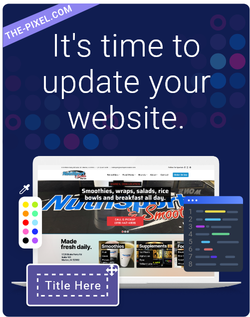
You’ve come across the phrase ‘less is more’, well, in some ways it’s true. When you first look at a website, if every available square centimeter is filled with content, it’s exceptionally difficult for your eyes to pick out the most important or relevant thing. So when it comes to designing websites, negative space can be your friend. Yes, it’s tempting to cram everything into one screen, because people might not stay on your site long enough to scroll all the way to the footer. However, squeezing every iota of information onto a single screen is going to mean bombarding users with potentially irrelevant information. As businesses, we risk creating websites we think users need based on our assumptions, rather than actually asking them what they want.
One take on page design (especially homepage design) is to start with a blank screen and only adding those features you know will be useful to your user. Doing anything else just risks diminishing the user’s overall experience, or just adding visual clutter for no good reason.
3. Your Content/Copy
Are your rambling? I’m not judging, it typically takes me three round of edits to remove all of the unnecessary waffle in my own copy. Storytelling is important, but time and attention spans are limited, so get to the point. Your copy ties into our point about whitespace — clutter is just going to confuse the eye and make your beautiful site harder to digest. There are a number of things you can do to combat this. Impose limits on your sentence lengths, for us, it’s ‘two typed lines in Arial size 11 on Google Docs’.
To remove some of the hassles, there are a number of plugins you can use. For WordPress, we use Yoast, which keeps track of your sentence and paragraph lengths, as well as identifying the passive voice and use of connectives. It also tests your copy against the Flesch Reading Ease test which assesses how easy your work is to digest. Whilst these tests aren’t foolproof, they will help you get into the habit of writing in an internet friendly way. The plugin then goes further and helps out with your SEO, prompting you to include your focus keyword in a Google-friendly way.
4. Your Calls-To-Actions (CTAs)
“Buy now” in big red letters isn’t going to cut it anymore. Your calls to action should be creative, innovative, and worked into the main sentence. Your aim is to use relevant language to attract attention, and push readers towards completing the desired action.
What your CTA is will vary on what your desired action, they don’t always have to be two words on a button. However, if you are putting your CTA on a button then it’s worth A/B testing different colors to find what works for you.
5. Your Thank You Pages
There’s nothing more terrifying than putting your bank details into a website, hitting ‘Submit’ and then nothing happens. Have they taken your money? Do you need to fill in the form again? Has the purchase gone through?
Do you see the problem? Without a thank you page, your user suddenly has a lot of questions, and this can sour the great experience they’d had up to that point. It’s a potential loss of trust and a wasted opportunity.
Your Thank You pages give you the chance to direct your new lead/customer to your other products and services. Your Thank You page can direct your user to “How To” guides which provide educational content, helping you establish your company as a trusted resource. Or, you can use this page to promote your services on the user’s social channels. This potentially widens your audience and attracts even more new leads. Whatever you choose to do, utilizing Thank You pages can help elevate your UX and increase the chance of a returning customer.
Final Thoughts…
There’s nothing more terrifying than putting your bank details into a website, hitting ‘Submit’ and then nothing happens. Have they taken your money? Do you need to fill in the form again? Has the purchase gone through?
Do you see the problem? Without a thank you page, your user suddenly has a lot of questions, and this can sour the great experience they’d had up to that point. It’s a potential loss of trust and a wasted opportunity.
Your Thank You pages give you the chance to direct your new lead/customer to your other products and services. Your Thank You page can direct your user to “How To” guides which provide educational content, helping you establish your company as a trusted resource. Or, you can use this page to promote your services on the user’s social channels. This potentially widens your audience and attracts even more new leads. Whatever you choose to do, utilizing Thank You pages can help elevate your UX and increase the chance of a returning customer.
Hire ThePixel to build your next website!
Since our founding in 2008, we’ve created and launched many types of business websites. Over the last decade and we’ve learned a thing or two! That’s why we’re masters of our craft, let us help you build the website of your dreams – one that generates traffic, leads and conversions.
Are you ready to start? If yes, contact ThePixel and one of our representatives will guide you through the website phases and how the process works either by a Zoom Meeting or phone.