How to Tell if Your Homepage is Terrible
How to Tell if Your Homepage is Terrible
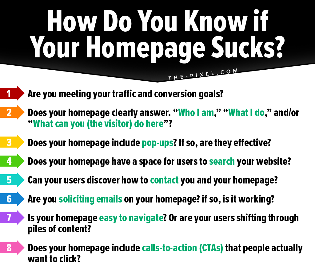
How do you know if your homepage sucks?
You switch on your laptop, get started, open your Internet browser and then search for what you need… only to find the site you land on is too slow or confusing. You move on to the next site.
A great website is one that people visit, recommend, and share. Google uses factors such as bounce rate, the amount of direct traffic, number of likes and shares on social media, and the amount of time visitors stay on your homepage to determine whether it is good or bad. Based on those factors, the Google algorithm ranks your site on a quality scale.
A homepage is your website’s main page and leaves your visitor or user with a first impression. It also often acts as an index for the rest of your site or tells your brands main story and message. Most blogs and websites have their own distinct homepage.
When designing your homepage, you should ensure it is as clear, unique, and interesting as possible and offers areas such as a drop-down menu. Remember, this is the first page your visitors will see. And it’s not rocket science, if your visitors see crap, meaningless or boring stuff, they will not want to come back looking for more.
You and I know the consequences of that.
Your homepage is most certainly the image of your business. It represents your brand. As a marketer, you should have a clear and concise idea of how you would want your homepage to look like in order to serve your visitors and customers seamlessly.
When it comes to the question of whether your homepage sucks or not you need to ask yourself a few questions.
You need to take the time to really consider the quality of the content your website is providing its visitors, and whether you had purpose or strategy while developing your homepage.
While most website owners would love to make their homepage as entertaining and captivating as possible, many still miss the mark at the design stage and they end up having to deal with a homepage that really sucks.
In this article, we will discuss how to tell if your homepage is a rock star or something visitors will steer clear of.
How much traffic? Numbers never lie!
This is one of the main indicators you can use to gauge the effectiveness of your homepage. You can use Google applications such as AdSense to determine the actual number of visitors coming to your website.
For example, if you find that the number of your daily visitors keeps on rising, then that means your homepage must be working. However, if the number of visitors is dwindling, then you should know that it’s time to change your homepage. Visitors arriving at your website should know exactly what your company does within their first few seconds.
Don’t leave them in the dark!
This is important, especially when you are dealing with products and services that are quite unique. By doing so, your visitors will navigate the website knowing exactly what they are looking for.
Only mentioning what the company does in the ‘About Us’ section is ill-advised since most visitors have no time navigating through the entire website. A larger percentage may even fail to spot it, costing you potential revenue.
Are there pop-ups on your homepage?
The use of pop-ups to capture information or link to other sites or social media pages is yet another form of online advertising on the web. It refers to images or videos that suddenly pop in the user interface.
They make navigation through the website very difficult and sometimes even impossible. These pop-ups also tend to have a higher data usage; therefore, affecting your visitor’s data plans negatively.
Many surveys have shown that users dislike pop-ups so use them wisely…
Is ‘Search’ available on your homepage?
If your homepage lacks a navigation tab or if the navigation really sucks, then your homepage sucks too! A homepage without a ‘search’ navigation tool is a major turn-off for visitors.
You need to understand that the content your visitors require may not be directly available on the homepage. A search tool is, therefore, meant to offer some consolation to them.
In the absence of a search option, many visitors will dread navigating your website and may leave your site—again leaving you with potential lost revenue.
Does your homepage display your contacts or info links?
if you want your customers and users to contact you, it makes a lot of sense to clearly display your contact info on your homepage as well as in another section in the drop-down menu.
How will you make money if you can’t connect with your customers? Not leaving contact info clearly on your website’s homepage is a bad idea. And this is for the obvious reasons. Many visitors interested in your products or services will want to make further inquiries.
As a matter of fact, including your contact info build immediate trust with your customer making your website and business seem more legit.
Are you blackmailing your visitors to submit their email addresses?
There are many websites out there that blackmail visitors into submitting their emails before proceeding to the main website. Most visitors dread these websites as they perceive that their emails may fall into the wrong hands and end up being used in ways that they have not agreed to.
Also, most visitors would love their email boxes clear of spam and junk! Many people will avoid subscribing to countless boring marketing messages in their inbox.
Now, all of this is not to say that you cannot effectively collect emails throughout your site as well as on your homepage in the right way.
How easy is it to navigate your site?
If your homepage navigation doesn’t clearly guide visitors through the site, they are likely to become frustrated and leave for good.
Many visitors are either amateur or don’t have the patience to navigate complex sites and, therefore, a good navigation system in your menu or through drop-down panels helps retain potential customers.
One click and they arrive where they want to be. Now here’s the good news… using professional and proper website builders will do this for you automatically!
Your website doesn’t have CTAs
What would you like your website visitors to do? Have you told them?
If you don’t tell your audience what to do next, they may simply leave and never return. A call to action (CTA) is a link in websites that helps direct users to the a desired action and also helps you to achieve your desired objective.
These call buttons are essential for a homepage as they help your visitors to get in contact with you for more information.
Wrapping up
Many website owners are motivated by the cliché: “If you build it, they will come.” Well, that’s not always the case. You can build and launch a beautiful site, but if it isn’t converting readers into buyers, you have a problem.
Therefore, you have to think about a site that appeals to your target market.
There you have it, folks. The ultimate questions that will help gauge whether or not your homepage and your website suck!
Hire ThePixel to build your next website!
Since our founding in 2008, we’ve created and launched many types of business websites. Over the last decade and we’ve learned a thing or two! That’s why we’re masters of our craft, let us help you build the website of your dreams – one that generates traffic, leads and conversions.
Are you ready to start? If yes, contact ThePixel and one of our representatives will guide you through the website phases and how the process works either by a Zoom Meeting or phone.