How Responsive Website Design Can Increase Sales
How Responsive Website Design Can Increase Sales
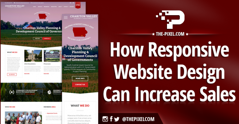
What is a Responsive Website Design?
In today’s competitive marketplace, a crucial element of success is the use of leading-edge website technology and design. One of the key trends on the rise in websites right now is responsive website design (RWD). Stated simply, if your website doesn’t have responsive web design, your business is likely under performing
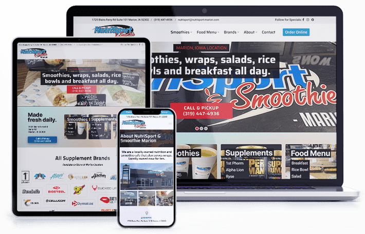
You’ve likely already encountered responsive websites while surfing online. These are the sites that quickly and automatically adapt to the screen size of your device. Responsive web design ensures that your website content displays correctly and uniformly on a variety of devices, platforms and screen sizes, without the need to create multiple websites. Special coding techniques are utilized that make a web page automatically adjust to the device or screen size for the best user experience possible. The ability of your website to look appealing and remain user-friendly on any size screen is crucial, since so many consumers are now using mobile devices. Sites with responsive website design look great on laptops and desktops, but they also adapt seamlessly to the small screens of mobile devices, with no more frustrating zooming and scrolling needed.
Mobile is on the Rise
Your website is a tool for both branding and generating sales. If your site doesn’t look good on a user’s device, their opinion of your brand can suffer. If browsing your site on a smartphone or tablet results in a frustrating experience, users are likely to click away altogether and find one of your competitors’ responsively-designed sites instead.
Worldwide, there are approximately 6.84 billion smartphones. To put that into perspective, that figure accounts for around 85% of the 8 billion global population. Google is visited 89.3 billion times a month. Google has 91.9 percent of the market share as of January 2022. Google processes over 8.5 billion searches per day.
Smartphone ownership was especially high among younger Americans, as well as those with relatively high income and education levels. It’s estimated that 90% of American millennial’s said their phone never leaves their side.
Google estimates that 90% of users alternate between their various devices in order to accomplish an online goal such as making a purchase. Clearly, the businesses that provide the most seamless online experience across all platforms will be able to generate more engagement, more positive brand sentiment and ultimately more sales.
Browsing Habits Have Changed
Each month there are more than 100 billion searches on Google. In fact, in April 2015, Google began rewarding more responsive sites with higher search engine rankings. In encouraging users to win “the shift to mobile,” Google further noted that in 2023 mobile searches surpassed desktop searches.
Google also found 75% of users prefer mobile-friendly sites, and half reported frustration or annoyance when encountering sites that weren’t designed with mobile in mind.
Responsive design results in a 15% increase in unique clicks among mobile users, according to a MailChimp study. RWD extends to your email, too. For instance, 55% of email opens are now happening on mobile devices.
RWD = Greater ROI
Mobile interactions have a growing impact on results, too. For instance, mobile users are twice as likely to share content than are desktop users.
According to Google, 74% of mobile users are more likely to revisit a site that works well on mobile. Additionally, 67% of mobile users were more likely to buy products or services from a mobile-friendly site.
Investing in a Responsive Website Design
Responsive web design takes the same basic design elements across all platforms, intuitively adapting them to the viewing environment. Fluid, proportion-based grids and flexible images ensure that your website will be optimized to deliver what your customers are looking for on any device.
Hire ThePixel to build your next website!
Since our founding in 2008, we’ve created and launched many types of business websites. Over the last decade and we’ve learned a thing or two! That’s why we’re masters of our craft, let us help you build the website of your dreams – one that generates traffic, leads and conversions.
Are you ready to start? If yes, contact ThePixel and one of our representatives will guide you through the website phases and how the process works either by a Zoom Meeting or phone.
