It’s Time To Go Responsive

It’s Time To Go Responsive
Approximately 6.84 billion smartphones. To put that into perspective, that figure accounts for around 85% of the 8 billion global population.
The stubborn refusal to acknowledge the growth of mobile search has now put many businesses at a disadvantage. The question is: How did this happen?
By now, you should know that, as of April 21, 2015, Google is penalizing websites which aren’t mobile-friendly. Failing to employ a responsive design for your website, in which your site looks and acts the same on whichever platform a visitor is using, will soon be catastrophic. Your traffic will halt.
Mobile Updates to Google’s Algorithm
On June 16th, 2021, Google began to roll out a broad core algorithm update called “The Page Experience Update.” This update is intended to bring a better experience to users by prioritizing pages that offer a quality page performance — ie fast load times, and a non-shifting, stable page. Google has always had some page experience metrics — mobile-friendliness, HTTPS-security, and intrusive interstitials⁴ — and they have prioritized fast pages since 2010, but with the 2021 Page Experience update, they are now introducing three new metrics to measure both speed and overall page experience. These new metrics are called Core Web Vitals.
The new Core Web Vitals include largest contentful paint (LCP), first input delay (FID), and cumulative layout shift (CLS). In addition to serving as lightweight ranking signals, these new metrics will help website owners monitor and improve the loading speed, responsiveness, and stability of their websites to ultimately build a better user experience (UX).
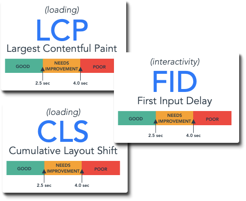
Core Web Vitals scores are calculated based on field data from the Chrome User Experience report. With that said, there is additional worthwhile lab data to reference on the journey to improving Largest Contentful Paint, First Input Delay, and Cumulative Layout Shift scores. We will look at both data in this section, as well as Google tools and reports you can easily access and use to measure, monitor, and fix these scores on your website.
Mobile Updates to Google’s Algorithm
What all this boils down to is the unmistakable fact that mobile and tablet devices are dominating the way people gravitate to websites. A question is typed or asked on a search engine, the answer appears, and the inquisitor navigates to the website suggested by the search engine. If the images and content on the site doesn’t adjust to the size of the screen, the visitor won’t have the patience to stick around. Google has devised, and provided, a test to determine if your site is in compliance with their new standards. Some actually might not know, so taking that test is critical. Knowledge is power.
Some businesses might have a separate mobile site, but two sources of HTML for the same site was always going to negatively affect SEO. I would also argue that having two websites makes no logical sense. Google and other leaders in search have been warning about the growing significance of mobile and tablet devices for several years. Why has this change to Google’s algorithm come as a surprise to some people?
There was a prevailing attitude over many years that businesses built websites because they had to. Their way of doing business hadn’t changed significantly for decades, but everybody had a website now so, reluctantly, they joined the crowd. But, nobody would ever want to visit their website on a phone! For some, then, this reluctance was predicated on practicality. Why pay for something that wouldn’t be needed? Google would argue that, inevitably, mobile will affect your business, but the mindset remains common.
Or, perhaps, some CEOs simply refuse to recreate their online presence for the sake of Google. There is a growing global anti-Google sentiment, especially in the European Union, which has been arguing that Google is too powerful and influential. This attitude may have considerable merit, but that doesn’t mean that Google is wrong about mobile. Stubbornness may be a desirable trait in some, but when it affects your bottom line, you are only hurting yourself.
Take a careful approach to this change in the search engine universe. A quick fix, patchwork solution probably won’t help, because browsers on multiple devices aren’t going the way of the passenger pigeon anytime soon. We’re going to see transformations in SEO increase, not decrease. The future that we were all told was coming is here.
Hire ThePixel to build your next website!
Since our founding in 2008, we’ve created and launched many types of business websites. Over the last decade and we’ve learned a thing or two! That’s why we’re masters of our craft, let us help you build the website of your dreams – one that generates traffic, leads and conversions.
Are you ready to start? If yes, contact ThePixel and one of our representatives will guide you through the website phases and how the process works either by a Zoom Meeting or phone.

