Good UX Reduces Decision Fatigue: Why Structure Matters More Than Visuals

Good UX Reduces Decision Fatigue: Why Structure Matters More Than Visuals
The real problem isn’t visual it’s structural
Good UX reduces decision fatigue.
If a user has to stop and think about what to do next, something isn’t clear enough.
This is one of the most common issues in modern digital products and it’s often misdiagnosed. Teams tend to focus on visual polish, UI trends, or adding more features.
But most usability issues don’t come from how something looks. They come from how it’s organized.
A clean UI can still fail if the structure underneath it isn’t guiding the user. Without clear hierarchy, flow, and prioritization, even well-designed interfaces create friction.
What this often looks like in real products:
-
Interfaces that look modern but feel confusing to use
-
Features that exist but are hard to find or understand
-
Flows that technically work, but don’t feel intuitive
How ThePixel helps:
-
Audits product structure beyond surface-level UI
-
Identifies breakdowns in hierarchy, flow, and interaction logic
-
Aligns design decisions with real user behavior, not assumptions
The hidden cost of hesitation
Every extra second of hesitation introduces friction.
Not obvious friction like an error, but subtle cognitive friction that slows users down:
-
Where do I go next
-
Which option should I choose
-
Did I miss something
These small pauses are easy to overlook, but they compound quickly across an experience.
Over time, hesitation leads to:
-
Lower conversion rates as users abandon tasks mid-flow
-
Increased drop-off in onboarding, forms, and key journeys
-
Reduced trust when the product feels inconsistent or unclear
Hesitation is rarely tracked directly in analytics, but it shows up in behavior patterns like delayed clicks, repeated actions, or incomplete tasks.
How ThePixel helps:
-
Uses analytics, heatmaps, and session behavior to identify friction points
-
Maps where users pause, drop off, or second-guess interactions
-
Translates behavioral data into clear UX improvements
Why decision fatigue is a growing UX problem
As products grow, they naturally become more complex.
New features, edge cases, and business requirements get layered on over time, often without rethinking the overall experience.
Modern interfaces often:
-
Surface too many actions at once without prioritization
-
Attempt to satisfy multiple user types in a single view
-
Present dense data without clear structure or meaning
This creates cognitive overload.
According to principles like Cognitive Load Theory, users have a limited capacity for processing information. When that capacity is exceeded, decision-making slows and errors increase.
In UX, this doesn’t always look like failure. It looks like hesitation, friction, and inefficiency.
What this leads to:
-
Slower workflows in operational tools
-
Missed actions or incorrect decisions
-
Increased support requests or training needs
How ThePixel helps:
-
Simplifies complex systems without removing necessary functionality
-
Designs for progressive disclosure, showing the right information at the right time
-
Balances business needs with user clarity through structured UX strategy
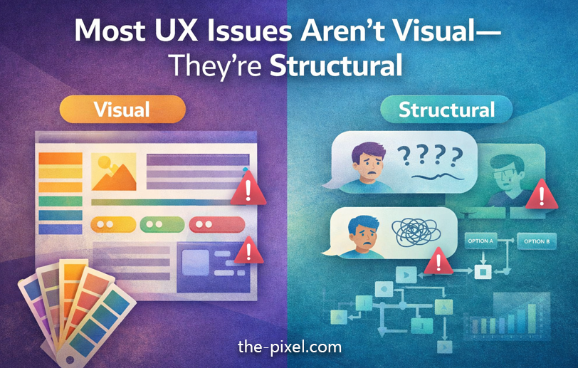
Most UX issues aren’t visual they’re structural
The core problem usually comes down to three things:
1. Unclear hierarchy
Users can’t quickly identify what matters most.
-
Key actions blend in with secondary actions
-
Important information competes with less relevant content
-
Visual weight does not match importance
This forces users to scan and interpret instead of act.
Impact:
-
Slower decision-making
-
Missed or incorrect actions
-
Increased cognitive effort
How ThePixel helps:
-
Defines clear visual and interaction hierarchy
-
Uses spacing, scale, and contrast intentionally
-
Aligns UI emphasis with user goals and task priority
2. Too many competing actions
When everything feels important, nothing is.
-
Primary and secondary actions are given equal emphasis
-
Too many buttons or options appear at once
-
The interface tries to support every possible scenario simultaneously
Instead of guiding users, the design shifts the burden of decision-making onto them.
Impact:
-
Decision paralysis
-
Inconsistent user behavior
-
Reduced task completion rates
How ThePixel helps:
-
Identifies and defines primary vs secondary actions
-
Reduces unnecessary choices without limiting functionality
-
Designs focused interaction patterns that guide behavior
3. No defined path forward
Users don’t know what happens next.
-
Flows feel disconnected or unclear
-
There is no sense of progression or completion
-
Feedback is missing after key actions
Even visually clean interfaces fail when users can’t confidently move forward.
Impact:
-
Drop-off in multi-step processes
-
Repeated or incorrect actions
-
Frustration and loss of trust
How ThePixel helps:
-
Maps end-to-end user flows across real scenarios
-
Designs clear, predictable interaction paths
-
Ensures feedback and system states support user understanding
UX trend designing for decision clarity
One of the most important UX trends right now is structural clarity.
We are seeing a shift toward:
-
Designing around user intent instead of features
-
Using progressive disclosure to manage complexity
-
Creating clearer action paths with fewer, more meaningful choices
-
Prioritizing content and data based on real usage
This is especially critical in complex systems like:
-
SaaS platforms
-
Operational dashboards
-
Logistics and workflow tools
-
Enterprise applications
In these environments, clarity directly impacts efficiency, speed, and performance.
How ThePixel helps:
-
Specializes in complex, real-world systems such as logistics, operations, and dashboards
-
Bridges UX design with technical constraints and system behavior
-
Creates scalable design systems that maintain clarity as products grow
What this looks like in practice
Improving UX structure does not mean removing complexity. It means organizing it.
Focus on:
-
Defining a single primary action per screen
-
Establishing strong visual hierarchy
-
Reducing unnecessary options
-
Guiding users through clear, logical flows
This allows complex systems to feel intuitive and efficient.
How ThePixel helps:
-
Translates complex requirements into clear, usable interfaces
-
Works closely with product teams and engineers to ensure feasibility
-
Designs systems that scale without losing usability
Final thought
Good UX reduces decision fatigue.
Most issues are not visual. They are structural:
-
Unclear hierarchy
-
Too many competing actions
-
No defined path forward
Every extra second of hesitation adds friction.
And friction adds up fast.
About ThePixel
ThePixel helps businesses create clearer, higher-performing digital experiences through UX strategy, UI design, web design, and conversion-focused optimization. From websites to complex product workflows, we design around real user behavior so your experience is easier to use, easier to understand, and easier to grow.
Need help improving usability, structure, or conversions?
Contact ThePixel to discuss your project.