Common Lead Generation Design Mistakes to Avoid
Common Lead Generation Design Mistakes to Avoid
Are your lead generation web pages performing at their absolute best?
When it comes to inbound marketing and growth-driven design, there is almost always room for improvement. And with only a few seconds to grab a visitor’s attention on a lead generation web design, even the most basic design crimes could be resulting in a poor user experience that turns visitors away—limiting your conversions, leads, and overall inbound marketing results.
Here is a roundup of some of the most common landing page design crimes that you should avoid if you want to see improvement.
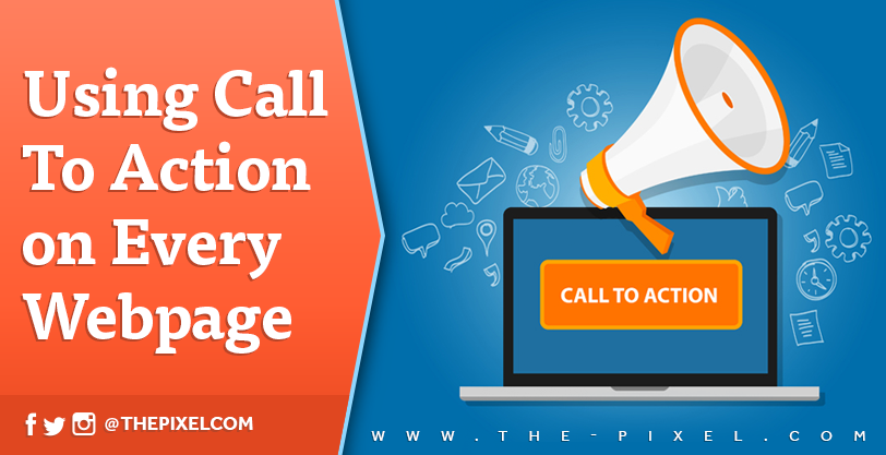
1. Multiple Calls to Action
Lead generation web pages should be designed with one action in mind: to convert the visitor on a form. When there are multiple calls-to-action (CTA) and paths for the visitor to take, you distract from the main message, which is that you have a valuable offer for your visitors and that they can request it by filling out a simple form. One call to action, supported by compelling copy on a very usable landing page, makes the user’s path to conversion clear, simple, and intuitive.
2. Poorly Written Copy
With one simple call to action and intuitive path toward conversion, well written copy is essential. Of course, grammar, punctuation, and spelling are important factors to consider, but large bodies of unbroken text or an excessive amount of copy on a landing page are turnoffs for visitors. Text should be broken up with short paragraphs and bullet points, and there should be just enough words to grab the reader’s attention, provide some further context, and tell the user what to do next. This should not only be concise, but compelling too. Don’t just describe the offer, tell users why they want it and how they will benefit from it.
3. Bad Typography
After working hard on wordsmithing the copy to convert visitors, make sure that it’s easy for them to read it. The size, color, font, and layout of the copy all have an effect on readability and the user experience. Avoid using copy that is too small (smaller than 16 pixels) or too light so that it’s difficult to read over the background. When using a background image or pattern, check the layout on all devices to make sure there is plenty of contrast on all parts of the copy and that it’s legible. The wrong font choice can also affect usability and the user experience. Some fonts are difficult to read and can leave an unprofessional impression with your visitors. Here’s a list of fonts to avoid.
4. Using Low-Quality Images / Not Using Images at All
Most people don’t read on the web, they scan—which means they skim over text until something catches their eye. Studies also show that the human brain processes images much faster than text. A well placed image on your landing page will quickly provide context and convey your message to site visitors who are in a hurry—most of them are. Poor-quality images, such as pixelated, generic, corny, or dated stock photos are a turnoff that can reflect poorly on your brand and make your offer less enticing.
5. Lengthy Lead Capture Form
When it comes to a landing page, the offer needs to be so enticing to the visitor that they are willing to give up their name, email, and other information in order to receive it. Asking for too much (or too personal) information in exchange for a simple offer like an e-book will cause visitors to bounce. How much is too much? That’s open to debate, but it depends on the offer’s stage in the buyer’s journey and the kind of information that is being asked. As a general rule, forms on landing pages should only ask as many questions as necessary in order to qualify prospects—and should typically be done one or two questions at a time. Inbound marketing tools like HubSpot allow you to queue questions for return visitors and build a contact’s profile over time through progressive profiling.
6. Cluttered or Complex Page Layout
Usability studies show that web users still read from left to right and top to bottom. Keep that in mind when placing the landing page’s headline, copy, call to action, and form. A natural flow for a landing page would be to present an attention-grabbing headline first, followed by a subheader to provide some context and make visitors want to read on, then a combination of copy and images to “sell” your offer, and finally a form with instructions on how to receive the offer. While it might be the most natural approach, it isn’t the only format for a landing page. (This is where A/B testing comes in.) However, the conversion path should be very intuitive for the user and follow a flow that makes the process easy. Keep it simple; avoid clutter and complexity.
7. Slow Page Loading Speed
Research shows that a single second delay in your website loading time can result in a 7 percent loss in conversion. It also shows that a whopping 40 percent of web users will abandon a website if it takes longer than 3 seconds to load. Fast load time is critical for any page on your website, but it’s especially important for your landing pages. When it comes to landing page design, avoid excessive use of sliders and other features that might be weighing the load time down. Compress images before adding to the page and make sure your code is clean and concise. Here are some more tips for accelerating page load time.
8. Not Optimized for Mobile Devices
A report published by Reuters states that 75 percent of internet use in 2017 will be from mobile devices, yet many companies are still failing to present a mobile-friendly layout. Not only should you consider how your landing pages render on mobile devices, but you should also account for the unique needs of mobile visitors when it comes to filling out your form.
No matter how great your offer is, your audience won’t receive it if they’re turned off by your website or if they have to jump through too many hoops to receive it. The keys to avoiding these landing page design crimes are to always consider the audience, to understand what they want, and to constantly seek out new ways to improve their overall user experience when accessing that information.
Hire ThePixel to build your next website!
Since our founding in 2008, we’ve created and launched many types of business websites. Over the last decade and we’ve learned a thing or two! That’s why we’re masters of our craft, let us help you build the website of your dreams – one that generates traffic, leads and conversions.
Are you ready to start? If yes, contact ThePixel and one of our representatives will guide you through the website phases and how the process works either by a Zoom Meeting or phone.