Designing for Mobile Users – 9 Considerations for Your Website

Designing for Mobile Users – 9 Considerations for Your Website
Designing for the Mobile User Experience
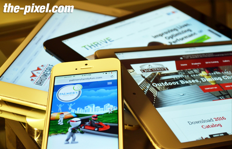
Mobile website traffic is increasing each year, and now encompasses over 50% of traffic worldwide. For our professional services and B2B audience, mobile traffic accounts for 20-30% of website traffic, and this percentage is growing.
The rise of mobile browsing makes it ever important to design specifically for mobile users. In today’s day and age, having a mobile-optimized website and separate designs for mobile users is table stakes.
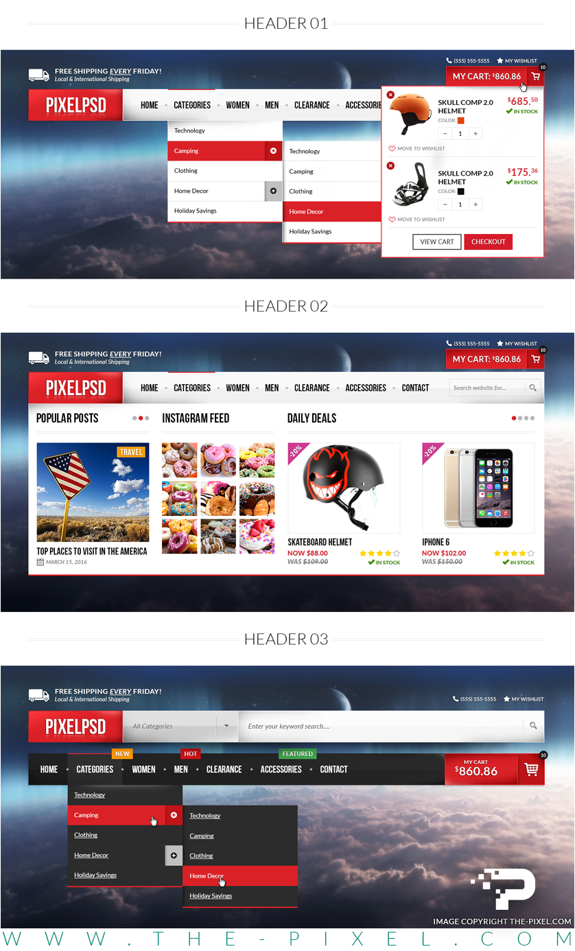
1. Design everything for large fingers
From menu and navigation, to call to action buttons, to links — Everything should be designed for someone with a large thumb to be able to tap. Space out your menu to allow for ample room for tapping each item, and keep menus short so that they display in their entirety on a mobile screen. Leave adequate space around all buttons, especially important calls to action.
2. Offer easy, consistent, prominent calls to action
Compared to desktop users, mobile users tend to be goal-oriented in their journey to your site, so don’t shy away from bold calls to action that are displayed prominently above the fold. Sometimes they’re looking for contact information, for directions, or to take another important action. Consider what they might be looking to do, and make large, prominent, and easy-to-find calls to action to help them accomplish their task. Calls to action should be easy—a simple click of a button. Mobile users should never have to copy, paste, or pinch the screen to zoom to accomplish something. Offering up clear buttons that lead a user along a journey is best.
Remain consistent with button styles and colors. Buttons are often framed in boxes, and typically use the brighter color in a color palette to draw attention. Stay consistent and leverage color as a cue. Choose one or two colors for links/buttons, and don’t use them for other text that is not an action item.
3. Design action cues in place of hoverstates
On desktop, action items are often underlined or change color when a user mouses over them. Desktop users are trained to explore with their mouse in order to know what actions are available. Mobile users are unable to navigate with cursors, and so designers must use other visual cues to prompt action.
Clear, descriptive buttons for tapping are encouraged for important calls to action. Animated cues are a fun and easy way to indicate that users should scroll or swipe. Highlighting buttons and links with animation, such as a jumping scroll indicator at the bottom of the homepage is a great way to highlight action items, so long as they’re not overwhelming. Spacing them out so that the user only sees one at a time as they scroll is typically better, as to not overwhelm users. Progressive disclosure – navigational information that displays as a user needs it – is also a great way to let users know their options without overwhelming them. Hoverstates that appear as users scroll are a great option to invite users to interact.
Whichever path you take, be consistent across your site. Establish consistent cues that tell users that something is tappable, scrollable, swipeable, etc.
4. Leverage commonly used navigation signals
When it comes to important navigational items, it’s often best not to try to reinvent the wheel. Three horizontal lines are often used as a menu button, and it’s a great way to save space on the page while also giving users constant access to navigational items. Arrows on either side of a section let users know to swipe (or tap the arrow). Pulling down on the screen is becoming a universal signal to refresh the page. Pull-up screens that come up from the bottom of a screen are becoming a popular way to give users the ability to explore something without losing their place on the website. Leveraging these widely-used signals will aid in users finding what they’re looking for on your site while enjoying a seamless user experience. When it comes to navigation, don’t make users think.
5. Make it easy to access the menu
Sticky menus that stay in place as users scroll down the page are a great way to keep navigational items handy. Menus that disappear as you scroll down, and then reappear as users start to scroll up are another way to aid in navigation. As a rule of thumb, never make a mobile user scroll all the way up a page before finding navigation.
6. Make forms seamless
Make forms frictionless. Forms should automatically scale to display the entire box while entering information, and the correct keyboard should pull up— e.g. numbers if the form field is a date. Push users to the next field in scenarios where they’ve entered 7 digits for their phone number or 8 digits for a date. Provide a visual calendar for selecting dates. It’s also beneficial to enable realtime validation for forms, where feedback is given to a user as they type in the fields, instead of only after the form is submitted. Don’t ask for more information than necessary.
7. Offer filtering for pages that serve up lots of options
When a site serves up a large amount of options, such as on a blog overview page, offer easy filtering for narrowing down choices. Consider lazyloading content automatically as users scroll down the page. This helps pages load faster initially, and only delivers as many results as necessary for a smoother mobile experience.
8. Consider the bottom of the screen prime real estate
As phones get larger, the top of the screen is increasingly cumbersome to reach with a thumb. Increasingly in 2019, mobile sites are taking a cue from applications and moving navigational items down to the bottom of the screen. Menu bars can be placed at the bottom of a screen and still be “sticky” at the bottom, or hamburger menu icons can appear at the bottom when users start to scroll up the screen, just as they often do when placed at the top.
9. Take page load speed to the next level on mobile
Many mobile users are browsing your site using data through slower connections than your average business wifi. Take this into account, and simplify the elements that often bog down a site— images and video. Consider replacing large videos that autoplay and make sure that all images are optimized for web and correctly sized for the purpose they are being used. Utilize lazyloading for pages that serve up lots of information so that pages load quickly initially and only serve up enough information as needed by users as they scroll.
9. Take page load speed to the next level on mobile
When it comes to designing for mobile user experience, there’s no substitute for user testing, particularly users that are unfamiliar with your site. You can leverage a tool such as HotJar and watch user recordings for clues on how users browse your site, where there may be hiccups and how to make the user experience even better.
Also, test it out with several people and collect feedback on their journey – Was anything cumbersome? Were they missing any information at any point in their journey? Were they able to find information logically? Ultimately, design plays a central role in user experience and designing for mobile should be given proper attention.

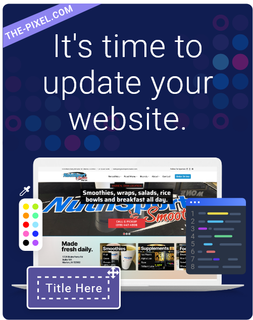
ThePixel is a website design, seo and digital marketing company located in Cedar Rapids, Iowa. Our website designs are custom designed for your unique brand and online presence. Since 2008, ThePixel has worked with hundreds of businesses to design, develop and launch their perfect website that lasts for years.
All Pixel websites are backed with a powerful content management system, search engine optimization and a modern mobile-friendly design. Let’s start building the website of your dreams – one that generates traffic, leads and conversions. Contact ThePixel and one of our representatives will guide you through the website phases and how the process works either by a Zoom Meeting or phone.
