Reasons to make your website mobile-friendly
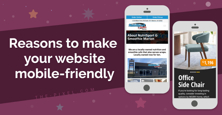
Reasons to make your website mobile-friendly
Making your website mobile-friendly is an absolute must.
If you’re like the majority of Americans, you are glued to your smart phone. You probably rely on it to respond to emails, keep track of the news and interact with friends on social media.
It is so important to reach your customer base when you own a website, and in the digital age that means making sure people on mobile devices can find and browse your site. It also means making sure they can remain as happy as possible during that experience. Smartphones and other mobile devices are more popular than ever before (and they are not going anywhere anytime soon), so optimizing your website for mobile isn’t just a trend or a side option, like it might have been in years past. Today, making your website mobile-friendly is an absolute must. If you do the research, the experts will all tell you the same thing, and they’re right. Mobile is where your customers are – so it’s also where you should be.
On that note, we’ve compiled a list of the top reasons to make your website mobile-friendly. So, without further ado:
1. Google prioritizes mobile-friendly websites
Google prioritizes mobile-friendly websites over those that are not in mobile search results. The Google algorithm change that occurred in 2015 tweaked the way Google displays mobile search results. Websites that are optimized for mobile rank better than those that don’t.
2. Mobile is everywhere
People everywhere use mobile devices to do everything from simple internet searches to purchasing big ticket items and much more. The reason? It’s fast and easy. Consumers in every industry want to connect and get what they’re looking for quickly. If you’re not optimized for mobile, you can’t offer your customers immediate service.
3. Build credibility
It helps you build credibility with your customers, clients, and influencers in your industry. With a mobile-friendly website, anyone who tries to visit your site on a mobile device will have a proper experience, and that will encourage them to see you as a credible resource for information, products and services.
4. Standard best practice
It’s becoming a standard best practice. Many websites are mobile-friendly with more and more coming online every day. Responsive web design has made mobile optimization more straight forward and accessible to everyone, and that means users have begun to expect this level of functionality to come standard when browsing on their mobile devices.
5. Increase your customer base
You can reach more customers, faster. Making your website mobile-friendly automatically opens your customer base up to anyone performing a mobile search. And even better, customers won’t have to hunt for your site or type in the exact URL to find it – they can just perform a search to find you quickly and easily.
6. First impressions matter
Make a lasting impressing, when a customer or a potential customer accesses your site to find information or look for something you sell, you want the experience to be nothing short of great. Because many people use mobile devices to access the web, only a mobile-friendly website can promise to offer that experience. Happy customers will return to your site and tell others about how great it is. Unhappy customers will do the opposite.
7. Google says so
Webmasters know when Google recommends you do something, you should really try to do it. This is the case with making websites mobile-friendly. Google has explained why mobile is so important in their own words, and the number one reason they cite is everyone has smartphones, and they’re constantly using them to search.
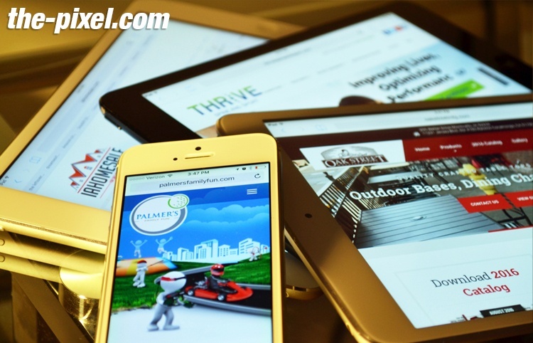
8. Responsive website design
Your website will look great and function well on any device, provided you use responsive web design to build or redesign your site. Why take chances when it comes to mobile optimization? With responsive design, your website will respond to the mobile device a person is using to access your site, and it will render to look and function well, no matter what.
9. Your online reputation
It benefits your reputation. Not just online, but offline as well. People will take note of a website they have a great experience with – and they will also take note of a website they have a bad experience with. Your online reputation is everything, and most businesses can’t afford to give people a bad experience – digital or otherwise.
10. Modern and relevant
Your business will be seen as modern and relevant. You might offer some of the most useful, valuable and unique products or services on the market, but if your website’s mobile experience is poor or non-existent, your company will be a digital dinosaur – encouraging people to seek help elsewhere. On the other hand, mobile-friendly websites are contemporary, cutting-edge and legit – they are how you get your foot in the door with anyone that has a smartphone.
In conclusion…
Websites that aren’t mobile-friendly are quickly falling by the wayside within our fast-evolving digital landscape. As time goes by, more and more websites will emerge that are mobile-friendly, pushing those that are not even further down the search results page and away from customers.
Hire ThePixel to build your next website!
Since our founding in 2008, we’ve created and launched many types of business websites. Over the last decade and we’ve learned a thing or two! That’s why we’re masters of our craft, let us help you build the website of your dreams – one that generates traffic, leads and conversions.
Are you ready to start? If yes, contact ThePixel and one of our representatives will guide you through the website phases and how the process works either by a Zoom Meeting or phone.

