Basic Principals of UI and UX Web Design
Basic Principals of UI and UX Web Design
Basic UI/UX design you need to know and follow
When it comes to UI/UX design there are some UX design basic principles you need to follow. After all, in a competitive space, it is the UI/UX that would decide upon your success. Let’s walk you through some of the basic UI/UX design you need to know and follow
Here are some of the basic differences between UX and UI:
- The first difference between the two is their functional role. UI represents how the final product would be in terms of its experience while UX represents the experience users would derive when using the product.
- UI is a deliverable term and you can count it on tangible parameters such as graphics, images, texts, links whereas UX is simply a process that is delivered to the user.
- While prototyping is often used when it comes to creating UIs this is not so in case of UX. The latter is the final experience that is derived after the design and development are over.
- The tools used in creating UI and UX are different. While full-fledged design tools are created when it comes to creating the UI in case of UX developers make use of wireframe tools during the development process.
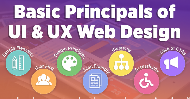
1. User first approach
The very term UX or user experience highlights the importance of creating an enriching experience for the users. All your creativity and website design skills can fall flat if your UX/UI doesn’t resonate with your target audience. You are designing the end product to ease the lives of the users and not showcase your creativity. Who are you creating this app or website for? The UX/UI on a game or entertainment app would be significantly different from one that allows users to book cabs or hire caregivers. Hence this is the first and foremost design principle to follow.
2. Less is always more
Minimalistic designs have become very common these days and it is not without a reason. In this crowd of screens, users are often looking for a break from the cacophony of colors, graphics, and text. Ask yourself if the product would work perfectly without that graphic or functionality? If yes, you can avoid that without any sense of guilt. The point here is a cleaner interface is more engaging and shall improve the conversion rate for your clients.
3. Follow known design principles
Youngblood designers often aim for success trying unconventional ideas but this doesn’t work when you force users through a new learning curve. While you have all the creative freedom in the world you must follow certain conventions. For instance, a user expects to see the shopping cart on the top-right corner on an eCommerce website. Placing it somewhere else might prove counterproductive. The logic here is to design a product that has similarities with what the user may already be used to.
4. Make it scroll friendly
The average time spent on websites and apps has been falling drastically and consistently. With so many options at hand, most users don’t have the time to read through all the texts or sit and admire your creativity. They’d mostly scroll down the screen on an app or scan through a website. This is where you need to make your design scan friendly. Use of infographics, color blocs and bigger fonts in the UI would help you in this regard.
5. Focus on hierarchy
When you have several ideas playing around in your mind hierarchy can often take a backseat. This is a cardinal sin that developers live to regret. Smooth navigation is one of the fundamental elements for the success of any app or website. You need to have your focus on two things here – how the content is organized in terms of categories/sub-categories and secondly visual elements on the screen that allows users to navigate seamlessly through the product.
6. Never ignore accessibility
One of your main aims as a designer as well as a developer is to create UX/UI that is accessible to everyone among the target audience. From people with color blindness to those who are farsighted (hyperopia) you need to cater to all. Using larger fonts and contrasting colors are the easiest ways to improve accessibility on the product. You have all the freedom to try other options you feel that would help improve accessibility for your target audience.
7. Lack of call-to-actions (CTA)
There is a reason you are always asked: “Are you sure you want to move this file to the Recycle Bin” when you delete something on Windows. The case here is no to penalize mistakes. One of the most important aspects of designing the perfect User Experience is also to allow users to confirm before they commit/take an action. Not doing so results in poor user experience and you should avoid this at all costs in your design.
Lets recap…
To sum up, as a budding designer or developer you should focus on creating the perfect marriage between UX and UI when it comes to designing applications and websites. When you are able to create the perfect intersection between the two keeping the needs and aspirations of your target audience you will be able to create PERFECT USER EXPERIENCE and take your clients’ brand forward. Remember it is a marathon and not a sprint and you will have to constantly keep adding to your technical know-how, creativity, and skills.
Hire ThePixel to build your next website!
Since our founding in 2008, we’ve created and launched many types of business websites. Over the last decade and we’ve learned a thing or two! That’s why we’re masters of our craft, let us help you build the website of your dreams – one that generates traffic, leads and conversions.
Are you ready to start? If yes, contact ThePixel and one of our representatives will guide you through the website phases and how the process works either by a Zoom Meeting or phone.