How-To Point Out Key Features In Your Mobile App

How-To Point Out Key Features In Your Mobile App
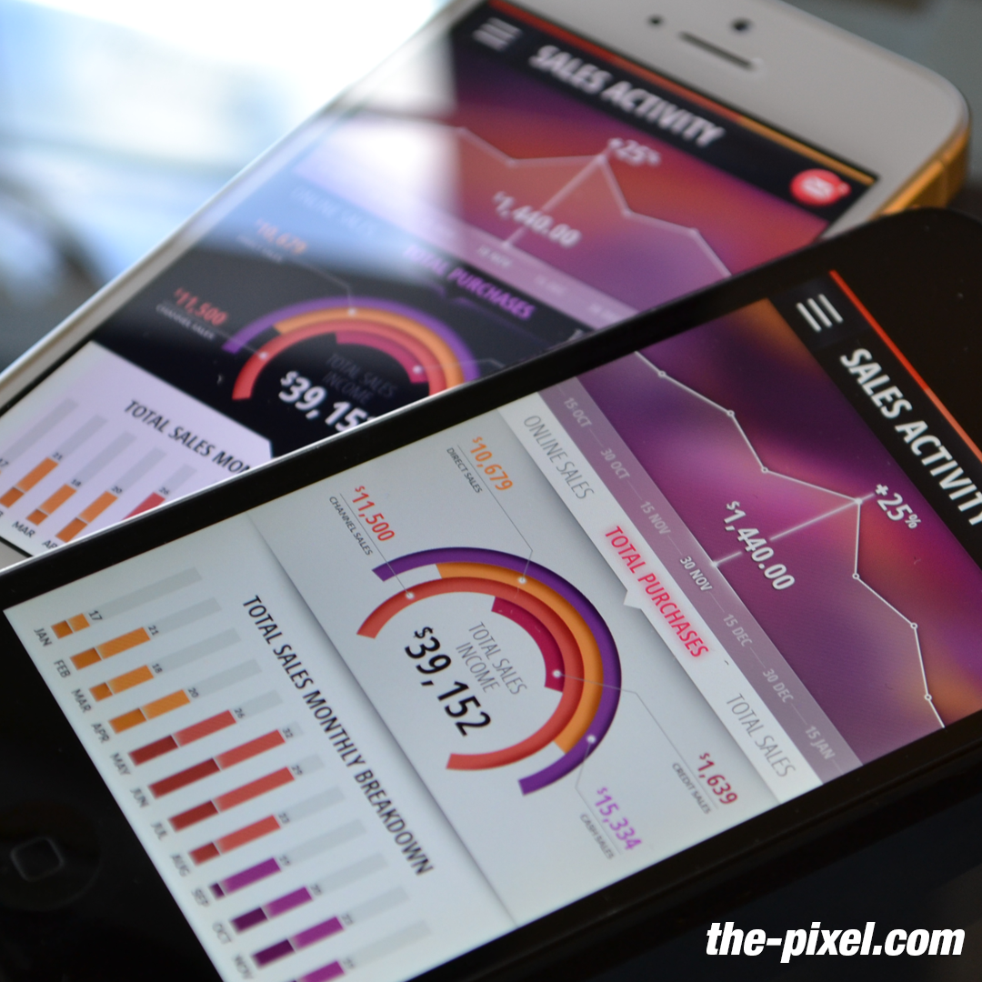
Your mobile app is dead in the water if users don’t know about key new features!
If you’re like me (and, for many reasons, let’s hope you’re not), you’ll regularly have trouble remembering certain things. It doesn’t matter if it’s important or not, I’ll still forget, unless I’ve set several reminders on my phone, stuck bright post-it notes on my front door, or received surprisingly cold-blooded threats from my mother. Predictably, I’m now I’m in danger of forgetting what I’m supposed to be writing about. Before that happens, let me get to the point: people forget things, and so people have to be reminded of things. Maybe more often than you think. And this all applies – you guessed it – to mobile apps.
How This Applies To Mobile Apps
You’ve optimized your onboarding into a slick and helpful flow that has significantly increased your retention rates. Your regular users go about their business with what seems like muscle memory flicks of the fingers rather than active thought. But there are features in your app that they still haven’t used – ones that you are counting on to improve your key metrics. Either users don’t know about them, or they’ve flat out forgotten about them. Furthermore, you’ve got a great new feature about to be released and you want it to be a success. It’s your duty to make sure that users not only know about all the great features that your app has to offer, but are also reminded of them, because, let’s face it, we’re human and we have truly pathetic attention spans (7 seconds and counting last time I checked).
How To Tell Your Users About Features
Thankfully there are a few smart ways to inform users about app features that are both simple to implement and super effective. Let’s take a look at them now:
1. ICYMI IAMs
For those of you unfamiliar with overly long and obscure acronyms, this stands for ‘in-case-you-missed-it in-app messages’. These messages are very similar in appearance and content to a usual onboarding screen; in this case, a full-screen takeover recapping one of the app’s key features. Perfect for those of us with flaky memories, or short attention spans who have skipped finding out about this feature entirely during onboarding. Target them at segments of users who have never used the feature, or who have not used it for a considerable length of time. In short, they’re a great way of getting casual users to use core features, as well as encouraging regular users to expand out of their comfort zone.
2. Tip Overlays
These are things of beauty; subtly, but effectively pointing out features in context while the app is being used, like a guiding angel highlighting the way to the kebab shop when the pub closes. A full-screen takeover, like the ones outlined in the above example, can be overly distracting, so use a tip overlay when you don’t want to dominate your user’s attention, but still want to get the point across. It also helps to point out key features or tricks without removing the user completely from the experience – which can be helpful when you’re offering help dependent on the context.
3. What’s New
Apps never refuse new features, but users often refuse to use them. You’ve spent a small fortune designing and developing a really great new feature, only for it to get lost in obscurity and the laziness of uninquisitive fingers and minds. Use a combination of in-app messages or tip overlays to make sure that the feature doesn’t get lost in the ether. Decide when the most effective time to serve the message is, and remember that isn’t usually at app open – when users will have a specific task to achieve. Use testing to find out through hard data when works best for your app.
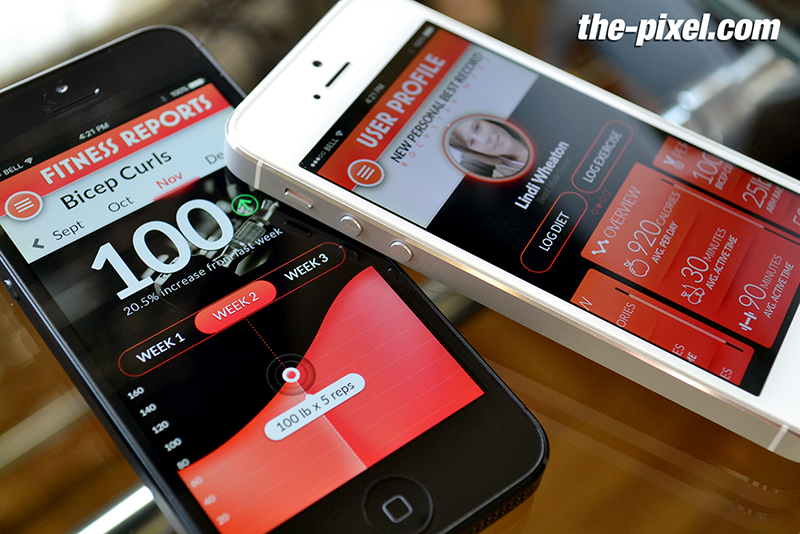
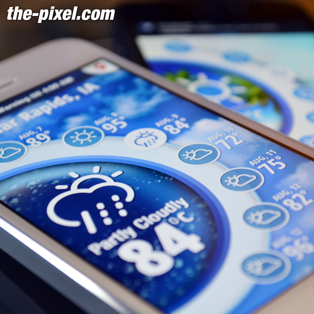
4. Rich Push
There is no better way to notify or remind your users outside of the app than a personalized, timely, and contextual push notification. The arrival of rich push adds images, gifs, videos and audio clips, as well as dynamic buttons so that users can carry out simple functions outside of the app. These are perfect for showing off an impressive new feature. Unfortunately, like most of the good things in life, overuse can be harmful; which bring me on to the next point.
How To Not Annoy Users
Like any messaging, it is not wise to remind users of features too often. At best you’ll get an eye roll and a sardonic sigh (not just from teenagers), and at worst users will close the app in frustration. I know that sounds petulant, but I’m speaking from experience here. Ideally, you’ll use segmentation to automatically categorize users into those who have used certain features, and those who haven’t. The type of frequency and recency capping tools found in ThePixel are also useful in helping you refrain from becoming irritating. So there we have it; simple to implement, effective at improving your key metrics – now you just have to remember to do it.
ThePixel is a website design, seo and digital marketing company located in Cedar Rapids, Iowa. Our website designs are custom designed for your unique brand and online presence. Since 2008, ThePixel has worked with hundreds of businesses to design, develop and launch their perfect website that lasts for years.
All Pixel websites are backed with a powerful content management system, search engine optimization and a modern mobile-friendly design. Let’s start building the website of your dreams – one that generates traffic, leads and conversions. Contact ThePixel and one of our representatives will guide you through the website phases and how the process works either by a Zoom Meeting or phone.