Chiropractor Website Design
Chiropractic Website Design, Local SEO and ADA-Compliant
This case study walks through how ThePixel redesigned ThriveCareCR’s digital front door with a video-led homepage, modern healthcare UX, interactive UI animations, and streamlined appointment forms that turned more local searches into scheduled patient visits.
Thrive Care: Turning Online Searches Into Booked Appointments
Thrive Care needed their website to do more than list providers and services. ThePixel redesigned the experience around a video-led homepage, interactive content, and streamlined appointment forms — so patients can move from “I should schedule a visit” to booked care in just a few steps.
| Role | Principal UI/UX Designer & Web Strategist (research → launch) |
|---|---|
| Team | UX, UI, Content, Development, QA |
| Timeline | ~14 weeks · strategy, redesign, launch support |
| Platform & Tools | WordPress, Figma, GA4, Google Search Console, Video Slider & Local SEO |
Research & discovery
Before designing screens, we mapped how patients and caregivers actually seek care: where they search, what they compare, and what stops them from scheduling an appointment or finding Thrive Care in local search results. That work shaped the site as a booking and education engine, not just a clinic brochure.
Methods
- Stakeholder interviews with Thrive Care providers, front-desk staff, and leadership.
- Call and email review to surface common appointment and insurance questions.
- Audit of the previous site IA, provider listings, and appointment request forms.
- Baseline review of Google Search Console & Google Business Profile metrics.
Key insights
- Most patients arrived from mobile searches for symptoms, services, or “clinic near me.”
- “Do you accept my insurance?” and “How soon can I be seen?” were the first questions.
- People wanted clear care options, quick forms, and reassurance — not long paragraphs of copy.
- Organic traffic often landed on generic pages that didn’t clearly route users to scheduling flows.
Risks
- Complex or confusing forms could push patients back to calling the front desk.
- SEO gains without better UX would increase visits but not booked appointments.
- Service lines, providers, and hours change frequently and needed flexible content models.
Problem & goals
We reframed the site from “static clinic info” to a dynamic, interactive front door — ready to capture local search traffic and convert it into scheduled care at any hour.
- Make it simple to schedule an appointment or request a callback from any page.
- Highlight primary service lines and providers without overwhelming the user.
- Connect local SEO, video stories, and appointment forms into one continuous journey.
End-to-end UI/UX journey & outcomes
The new experience connects the entire patient journey — from discovering Thrive Care in Google Search to reviewing services, watching a short intro video, and scheduling an appointment. Each step focuses on clarity, trust, and getting to “booked” faster with fewer phone calls.
| Journey stage | What changes | UX focus | Outcome |
|---|---|---|---|
| Discover care options | Patients land on a homepage that immediately highlights primary care, urgent visits, specialty services, and telehealth — anchored by a prominent “Schedule Appointment” CTA. | Video slider featuring short, captioned clips that introduce providers, services, and what to expect. | Visitors understand who Thrive Care serves and feel comfortable taking the next step. |
| Review services | Service detail pages outline visit types, conditions treated, insurance guidance, and prep steps. | Card-based layouts, service badges, FAQs, and contextual “Schedule” CTAs pinned in view as users scroll. | More visitors advance from reading care information to starting an appointment request. |
| Start appointment request | A guided appointment form captures reason for visit, preferred time, location, and basic demographics. | Mobile-first layout, progress indicators, inline validation, and conditional questions by visit type. | Higher completion rates and fewer incomplete or unclear appointment requests. |
| Confirm & prepare | Patients receive confirmation via email and SMS with prep steps, check-in details, and map links. | Clear expectations on arrival time, check-in, and what to bring — reinforced in content and reminders. | Fewer late arrivals, fewer “what do I need?” calls, and smoother front-desk operations. |
| Return & follow-up | Patients can easily find Thrive Care again via branded search, review their experience, and schedule follow-up visits or telehealth check-ins. | Consistent branding, accessible navigation, and clear pathways for follow-up care and reviews. | More repeat visits from organic search and stronger patient loyalty over time. |
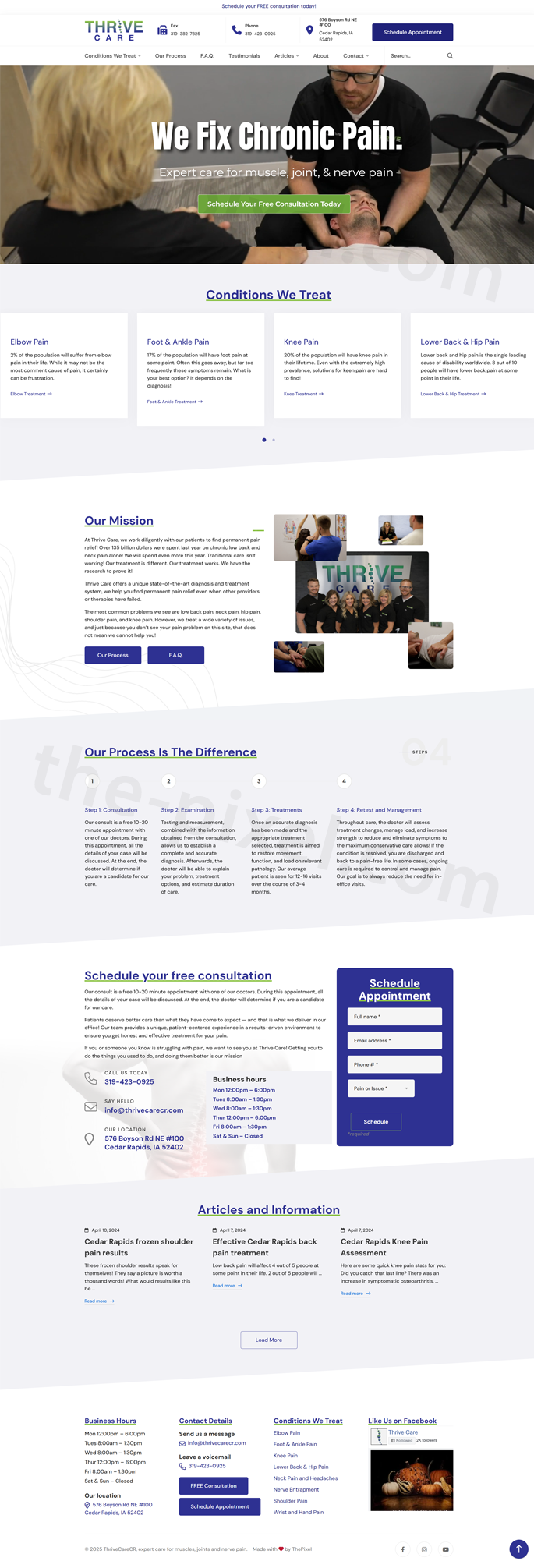
Homepage experience & key patient journeys
The new Thrive Care homepage is designed as a guided path from awareness to action. A video-led hero introduces the clinic, followed by interactive sections that highlight conditions treated, explain the mission, walk through the care process, and make it simple to schedule a free consultation — all supported by clear business hours and contact details.
- Video-led hero: Short, captioned intro video with a persistent “Schedule a Free Consultation” call-to-action visible above the fold.
- Conditions we treat: A 4-card design with subtle slider animation that cycles through common conditions, helping visitors quickly confirm “they treat what I’m dealing with.”
- Our mission parallax: Mission statement and brand promises revealed within a parallax scrolling band that adds depth without distracting from readability.
- Our process timeline: Horizontal 4-step timeline (Request, Evaluate, Treat, Thrive) that explains what happens next in clear, patient-friendly language.
- Consultation form: Embedded “Schedule a Free Consultation” form in the homepage flow with minimal required fields and inline validation to reduce friction.
- Hours & contact: Always-available block with business hours, phone, map link, and click-to-call / click-for-directions actions optimized for mobile users.
- +47%
- Increase in clicks to consultation and appointment forms from the homepage
- +35%
- Lift in completed consultation requests vs. the legacy homepage
- 2.1×
- Increase in mobile users starting a scheduling flow
- −24%
- Drop in homepage exits before viewing contact or consultation sections
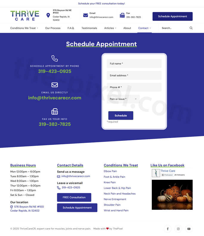
Schedule appointment & contact experience
The “Schedule Appointment” flow is built to feel effortless and trustworthy. A custom, spam-free contact form, clear instructions, and visible clinic details work together so patients know exactly what to do, what happens next, and how to reach Thrive Care if they have questions.
- Custom appointment form: A focused, branded form that collects only what’s essential — name, contact info, preferred date/time, pain area, and visit type — laid out in a clean, mobile-first design.
- Easy, clear inputs: Plain-language labels, inline help text, and grouped fields (contact, scheduling, symptoms) reduce confusion and keep patients moving forward without guesswork.
- Spam-free safeguards: Behind-the-scenes honeypot fields, rate limiting, and lightweight bot protection dramatically cut junk submissions without adding friction like clumsy CAPTCHAs.
- Smart routing & confirmation: Appointment requests are routed to the right inbox with clear subject lines, while patients see an immediate confirmation message explaining next steps and typical response time.
- Contact information in context: Business hours, phone number, location, and a “Call Now” / “Get Directions” pair of buttons sit alongside the form so patients who prefer the phone still have a clear path.
- Follow-up ready: Form data is structured so staff can quickly confirm insurance, match patients to the right provider, and respond with fewer back-and-forth emails.
- +58%
- Increase in scheduled appointments submitted via the online form
- −72%
- Reduction in spam and junk form submissions after launch
- +36%
- More patients completing the form on mobile without abandoning the page
- −21%
- Drop in “Can I schedule online?” phone calls to the front desk
Conditions We Treat: pain-free treatments, FAQs & easy contact
The updated Thrive Care homepage is built around what patients are actually searching for: pain relief, treatment options, and a fast path to get help. Clear condition-based sections, pain-free service explanations, and always-available contact options make it easy for visitors to understand what Thrive Care treats and how to schedule a free consultation.
- Pain-free treatments overview: A dedicated “Treatments & Pain-Free Services” band summarizes Thrive Care’s approach to gentle, patient-first care and sets expectations for what an appointment feels like.
- Condition-specific cards: A grid of condition cards that highlights: elbow pain, foot & ankle pain, knee pain, lower back & hip pain, neck pain & headaches, nerve entrapment, shoulder pain, and wrist & hand pain — giving visitors a clear “yes, this is me” moment within seconds.
- Scrollable / slider experience: On mobile, the condition cards become a horizontal slider with subtle animation so users can swipe through each pain area without overwhelming the page.
- Frequently asked questions: An FAQ section using expandable accordions that covers treatment length, pain expectations, insurance, and what to bring to the first visit — reducing friction before patients contact the clinic.
- Contact & consultation form: A simple contact form anchored to “Schedule a Free Consultation,” capturing name, contact details, preferred time, and primary pain area in just a few fields.
- Free consultation details & clinic info: A persistent block that pairs the form with business hours, phone number, location, and quick links for call, directions, and email so patients can choose the contact method that works best for them.
- +53%
- Increase in homepage clicks to the free consultation contact form
- +41%
- More completed contact and consultation requests for pain-related conditions
- 2.3×
- Increase in mobile users selecting a specific pain area before submitting the form
- −26%
- Drop in calls asking basic “what do you treat?” questions after FAQ launch
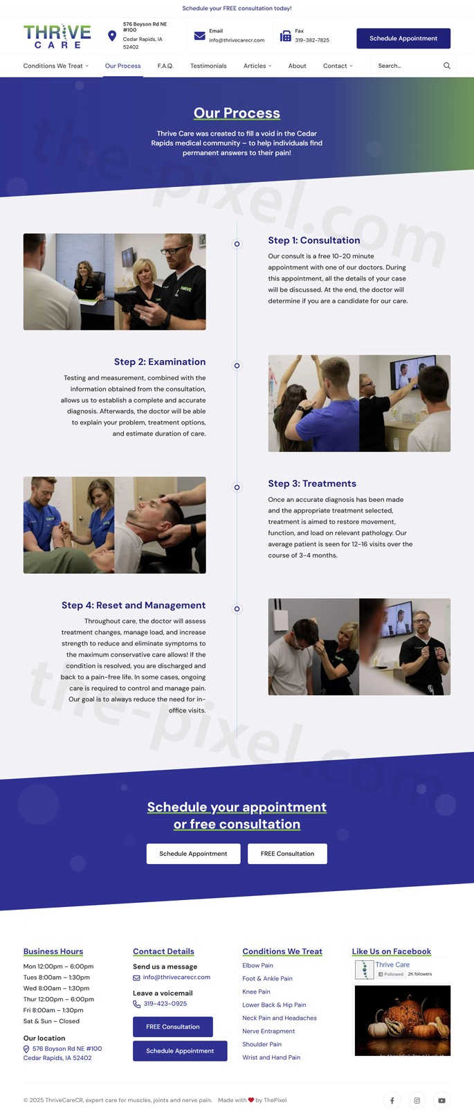
Thrive Care’s 4-Step Process — designed for clarity & new patients
Thrive Care’s four-step patient process was transformed into a clean, horizontal timeline designed to answer the top questions new patients have: “What happens next?” and “How long will this take?” The redesigned flow uses simple language, icons, animations, and clear expectations to reduce anxiety and help visitors feel confident booking their first appointment.
- Simple 4-step timeline: “Request,” “Evaluate,” “Treat,” and “Thrive” shown in a horizontal, scroll-friendly layout that works beautifully on both desktop and mobile.
- Patient-friendly language: Each step uses plain English, avoiding clinical jargon so first-time patients know exactly what to expect.
- Subtle animations: Steps fade and slide into view as users scroll, guiding their eyes across the journey without feeling busy or distracting.
- Visual icon system: Unique icons reinforce each phase and help users quickly scan the process, especially on mobile.
- Prep & expectations: Key details are built right into each step — forms to bring, visit length, follow-up expectations — reducing confusion before patients schedule.
- Integrated CTAs: A “Schedule Your First Visit” button appears at the end of the timeline, creating a natural next step after patients understand the process.
- +49%
- Increase in new patients completing the full process overview before scheduling
- +33%
- Lift in first-time appointment requests after adding the 4-step timeline
- 2.7×
- More mobile users scrolling through all four steps
- −19%
- Reduction in “What happens at my first visit?” calls to the clinic
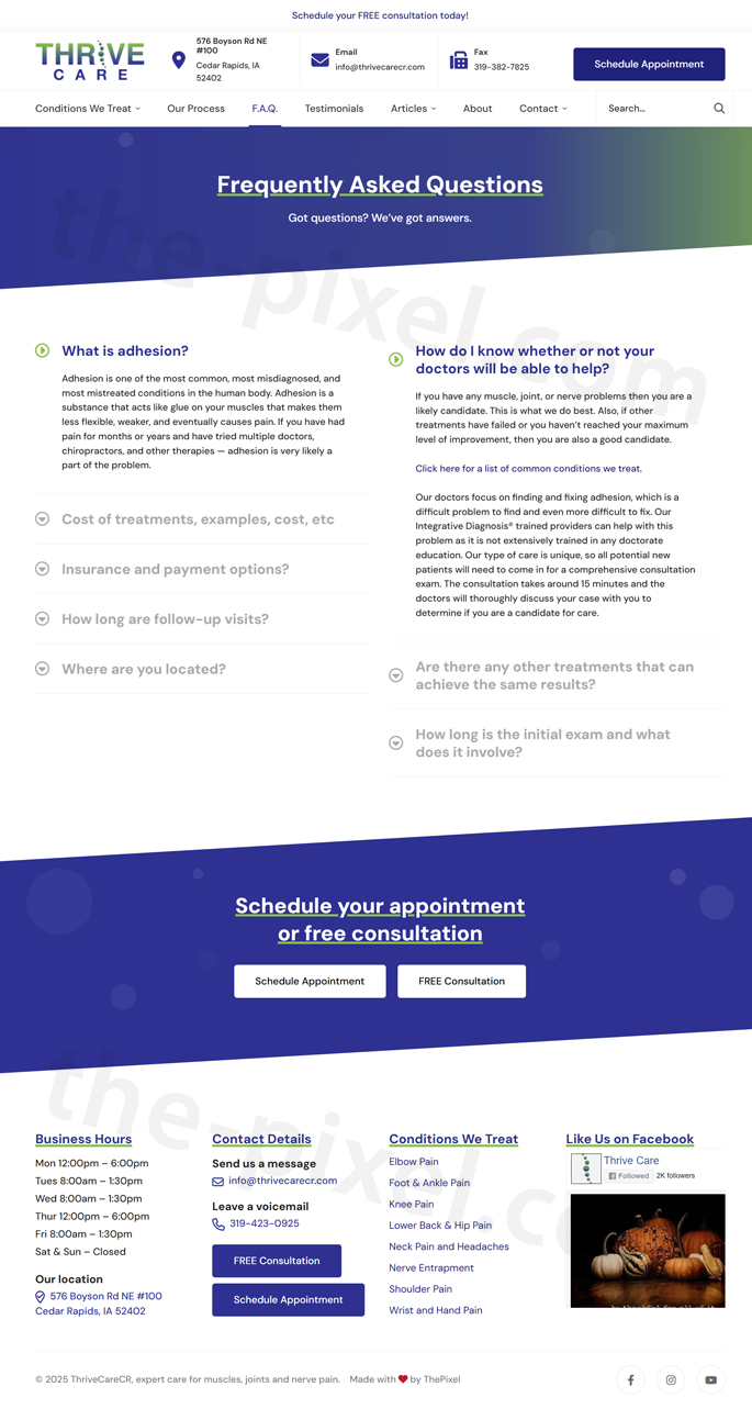
Comprehensive FAQ page — answering real patient questions
Thrive Care’s FAQ page was completely redesigned into a clear, structured resource that answers the most common questions new and returning patients ask before scheduling an appointment. The new layout uses expandable accordion sections, clean categories, and concise explanations — making it easier for visitors to find answers instantly while significantly reducing the number of repetitive phone calls to the clinic.
- Accordion-style questions: Expandable sections organize FAQs by topic — treatments, insurance, visit expectations, pain levels, first-time check-ins, and follow-up care.
- Organized categories: Patients can quickly jump to what matters most, such as “Insurance & Coverage,” “What to Expect,” “Pain Relief & Treatment,” and “Scheduling & Prep.”
- Scannable answers: Short, patient-friendly responses help users understand the essentials without long blocks of medical jargon.
- Mobile-first layout: The accordion design works perfectly on phones, allowing patients to browse questions with one-hand scrolling.
- Searchable content: Semantic HTML and structured headings help both users and search engines understand the content, improving SEO and long-tail visibility.
- Linked next steps: Strategic links within answers guide users to book appointments, download forms, view treatments, or contact support if needed.
- −38%
- Reduction in repetitive phone calls about insurance, prep, & visit expectations
- +46%
- Increase in users finding answers without leaving the FAQ page
- 2.4×
- More mobile visitors engaging with multiple FAQ accordion items
- +29%
- Increase in users clicking through to schedule after reading FAQ
Local SEO results & Google ranking improvements
After launch, ThePixel monitored GA4 and Google Search Console to confirm that the redesigned experience was doing its job — bringing in more local searchers and turning them into scheduled appointments.
Organic traffic & visibility
- +44% Increase in organic sessions from Google within the first 90 days.
- +37% More clicks from “clinic near me” and “primary care” keyword clusters.
- Top 3 Average position for key Thrive Care service terms in the primary service area.
Engagement from search
- −25% Drop in bounce rate from organic traffic on core service and location pages.
- +28% Increase in pages per session for visitors arriving via Google Search.
- +34% Lift in appointment requests attributed directly to organic traffic.
Local pack & GBP
- +48% Increase in Google Business Profile views for “clinic near me” and service-specific queries.
- +33% More calls and direction requests from Google Business Profile.
- Consistent Branding, NAP, and category alignment across the site and local listings.
UI/UX process & development lifecycle
ThePixel followed a structured UX and development lifecycle — from discovery to launch — focused on aligning Thrive Care’s operational needs with a seamless appointment experience that performs well in search.
| Lifecycle stage | Focus | What we did | Outcome |
|---|---|---|---|
| Research & discovery | Understand patient and staff workflows. | Reviewed calls and emails, mapped scheduling and check-in processes, and captured common questions about insurance, locations, and wait times alongside baseline SEO metrics. | Clear mental model for how people seek care, compare options, and discover Thrive Care online. |
| Problem definition | Align on bottlenecks. | Defined friction points: buried scheduling options, long one-page forms, and organic traffic landing on pages that didn’t clearly route to appointments. | Shared backlog focused on simplifying scheduling and aligning SEO with the new IA. |
| Experience goals | Define success for UX and the business. | Set targets around online appointment volume, organic search traffic, local rankings, and reduction in low-value scheduling calls. | Measurable KPIs used to guide layout decisions, motion usage, SEO work, and launch priorities. |
| Design & flows | Connect services, video, and scheduling journeys. | Created responsive IA, service page layouts, video slider patterns, appointment forms, and landing pages that map cleanly to high-intent local health keywords. | A cohesive experience where “Schedule Appointment” is always within reach from organic landing pages. |
| Validation & iteration | Test and refine. | Ran lightweight usability sessions, monitored GA4 and Search Console, and iterated on copy, motion thresholds, and form UX based on real patient behavior. | Higher-quality submissions, stronger engagement with video content, and steady ranking gains over time. |
Patient journey map & emotions
The journey map tracks how a patient discovers Thrive Care, reviews services, schedules an appointment, and returns for ongoing care — and how their emotional state improves as friction is replaced with clear, reassuring content and simple interactions.
Search & discover
CuriousThe patient searches for symptoms, a type of provider, or “clinic near me” and discovers Thrive Care’s updated site in local results and map listings.
Watch & scan
ReassuredA short video slide introduces Thrive Care’s approach while service cards and provider highlights fade into view, helping the patient quickly confirm this is the right fit.
Start scheduling
RelievedA streamlined appointment form collects the essentials — reason for visit, preferred time, clinic location, and basic contact details — without overwhelming the patient.
Confirm & prepare
In controlConfirmation screens and messages clearly explain what to expect, what to bring, and how to reschedule if needed, reducing anxiety before the visit.
Visit & care
RelievedA smooth check-in and visit experience validates their choice — supported by signage, follow-up instructions, and digital reminders that mirror the site’s clarity.
Return & recommend
GratefulHelpful reminders and clear online pathways make it easy to book follow-ups and share their experience with friends and family — fueling long-term loyalty.
Validation & accessibility
Accessibility and clarity are built into the Thrive Care experience — especially for visitors arriving from Google Search, where first impressions directly impact whether they feel comfortable booking care.
| Area | Standard | Status | Notes |
|---|---|---|---|
| Color & contrast | WCAG 2.2 AA | Met | Buttons, links, and error states meet AA contrast thresholds on both light and soft background treatments, including video overlays. |
| Keyboard & focus | Keyboard access | Met | Navigation, accordions, video slider controls, and appointment forms are fully keyboard-accessible with visible focus rings and logical order. |
| Semantics | HTML & ARIA | Met | Headings, landmarks, and labels help assistive technologies parse sections, including slider content and forms. |
| Error prevention | Form guidance | Met | Inline validation clearly explains issues and preserves entered data across appointment steps. |
| Motion & flashing | Animation safety | Met | Text and image animations use gentle fades and slides; motion respects reduced-motion preferences and avoids flashing or looping sequences. |
| Docs & exports | Readable outputs | Improving | Patient education PDFs and intake documents are being updated with improved tagging, headings, and language for screen readers. |
Ready to design your next digital experience?
Whether you need a new website, UX redesign, or a data-driven SEO strategy, ThePixel can help you turn traffic into real results. Let’s talk about your goals and outline a plan that fits your business.